Poster Design
Why does design matter?
It's a question I often think about, because most all of the answers I've heard, or have come up with, don't seem to be quite right. Design is not good typography, color, form, patterns, user-experience, or user interfaces. Design, to me, at its core is communication. It’s a language, really.
Languages are filled with words. If you want to communicate something clearly, say the right words in the right order. Language, much like design, is greater than the sum of its parts; words alone have meaning, but together they can take on new meanings and communicate more effectively. My point: Language and design are all about knowing the “words” and defining the “order”.
The “words” of design are simple, and there aren’t that many: Color, Shape, Texture, Space, Form, Unity, Balance, Hierarchy, Scale, Dominance, Contrast. These are the words of the language we speak, and if we use the right words in the right order, they too can take on new meanings and communicate more effectively.
Design matters because communication matters. With that, we have the power to drive powerful conversations that can serve as a catalyst for change.
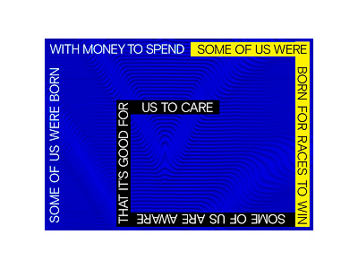
On another, more relevant note, this is a design of a poster. It was created to serve as a reminder for the viewer that life isn't fair for anyone, and we should give a damn about that. The words are taken from Marvin Gaye's song, "Right On". It intentionally has no "Right Side Up", no orientation; it's unbiased. The position is to be defined by the owner. Because much like the lyric, they control who they focus on, relate to, or ignore: The lucky, the unlucky, and those who care.

