Google Messages Redesigned | Material Design 3
I Redesigned Google Messages in Figma
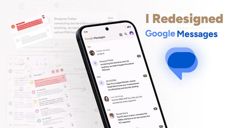
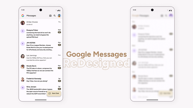
I challenged myself to redesign the homepage UI of Google Messages. It wasn’t supposed to be a Major UI Revamp; it had small parts and details that I felt could be improved.
Little Backstory
Have you ever wondered why your Messages app looked and felt so overwhelming and attention-grabbing whenever you opened it to check your essential messages, trying to ignore the bank/credit card/data recharge packages? Still, it couldn’t be ignored even if you wished to.When I changed the Default SMS App from my Settings and Opened Google Messages, it felt overwhelming and attention-seeking. I didn’t know where to focus; everything just grabbed my eyes.That day, I had an idea to redesign this app for practice and try out what I could improve.
