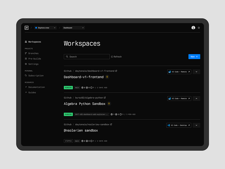
Daytona - dashboard layout
I've been working on Daytona's product for a few weeks now, shaping up the core brand, and now the product. I'm not a trained nor experienced product designer. I'm mostly doing this (and sharing) to prove myself I can do it.
As I'm about to post this I know many things are imperfect and how a dribbble post is not (and will likely never be) the place to give the full-full context of why it got to be this way. For me this types of post is just a mini-release as I try to juggle many workstreams (and a 1 year old).
Shaping brand/content/site/product is a fascinating exercise that when handled by one designer (classic early age scenario) leads to many compromise and back-burner items. This is a great example of that – not great but real.
---
Just to prove I'm not a complete fraud, here is everything not working:
key lines feel too striking
button/titles scale feels off
Header is tiny, content much bigger, that's odd
secondary colors: backgrounds too dark & too light
Type hierarchy is okay but not elegant
WTF is that search bar
~ addition to this list and suggestions are welcome
Basically, here is yet another dashboard – Merry Christmas Dribbble
✌️
