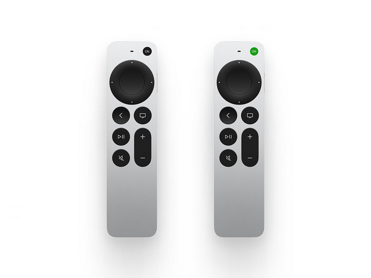
Daily UI (15/100): On/Off Switch
BEFORE, AFTER. ON, OFF. THIS IS THE WAY LIFE WORKS. BUT IT CAN BE BETTER. WE JUST NEED TO PUT IN THE EFFORT. I don't necessarily have any real issue with the remote or Apple TV itself per se but...
Maybe it's me but this particular Apple product does feel less intuitive than most of the others. I know where the ON button is because I'm used to it and it's simple and where it's supposed to be but the rest of it needs some more usablity testing.
It's always the same: I start off looking for something and end up mashing buttons trying to figure out how to get to previous epiodes of A Murder At The End Of The World, cursing - and some times not so softly - along the way.
And it's frustrating but not enough for me to say, "That's it, that's enough, no mas...
Listen: I love Apple products and even though I'm complaining I'm really not. But would it kill Apple to include some instructions? You could even do the IKEA thing and just include hieroglyphics.
Take a look at the prototype but seriously the pic above tells you exactly what I was aiming for as a solution to today's UI challenge. And I think it's a good one at that.
But if you think otherwise just let me know what I could have done better. I'm always looking to learn. And isn't this really what this is all about? To be better?
And if you'd like to see more of my work or just learn more about me:
