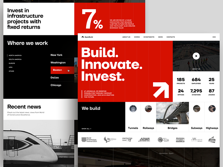
Real-Estate Construction Company Website
When we were designing this real-estate company website, we experimented with the layout. By dividing the space into blocks of different sizes, we can guide the user’s eyes through the page. They are attracted by crucial information first, and then switch to additional data like numbers. At the same time, the clients are not overwhelmed by the visuals and consume info block by block. This approach decreases the chance of people losing the data they have been looking for.
Have a beautiful idea in mind? Let's collaborate!
design@conceptzilla.com
Conceptzilla
A design concept is what you need when time crunch doesn't allow for a complete process. This is where Conceptzilla comes in handy. We design up to four main screens of your product, ready for public display. Fixed price. One week.
Let's collaborate!
design@conceptzilla.com
Discover more about us at conceptzilla.com


