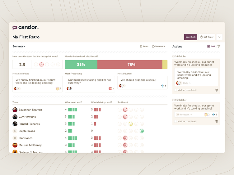
Candor Retro Summaries
Have you checked out the Retro Summaries on Candor yet?
Their quite a hit on our original retro software, and additionally quite a fun design project, I had three clear goals in mind —
🔎 First, I wanted to create a quick digest that could encapsulate the essence of a retrospective in a flash. My aim was to cut through the noise and deliver feedback that was both fast and meaningful.
🍭 Second, I focused on crafting a snackable visual – something engaging and easy for teams to understand at a glance. I envisioned a design that was not just informative but also visually appealing.
📄 Lastly, it was crucial for me that these summaries could be easily shared with executives. I aimed for a design that could communicate key insights in a concise and impactful way, suitable for higher-level discussions.
And while the Retro Summaries are part of our free package at Candor, they're also a sneak peek into the kind of sleek, user-friendly features we're packing into Candor Pro.
