PHETLAIPHONE GROUP | LOGO DESIGN & BRAND IDENTITY
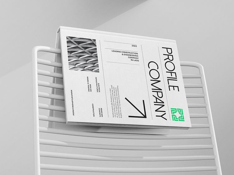
Phetlaiphone Group is a leading construction and engineering company in Laos that has been operating for more than 20 years.
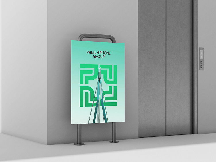
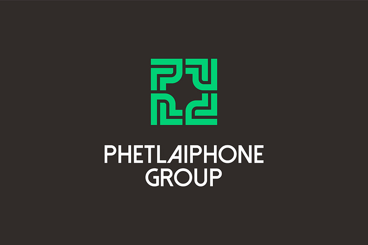
Rebranding Phetlaiphone Group, Bee Art opted for green – a color associated with freshness and dynamism. Green is often used to represent green building projects, buildings designed and constructed, building materials to minimize negative impacts on the environment and optimize energy use, towards sustainable development.
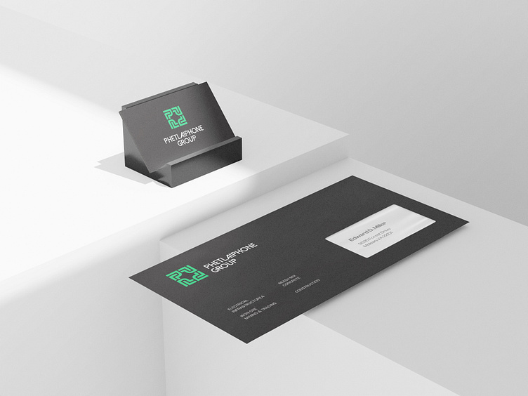
The logo is inspired by the letter P in the brand name combined with the image of iron pillars in construction, forming a closed and solid square. Squares are often associated with meanings of stability and durability. In the field of construction, where stability and durability are most important, the use of squares in the logo is Phetlaiphone Group's affirmation of product quality.
Designed by Bee Art
-
Client Phetlaiphone Group
Logo and Branding Project. Logo is designed for Construction and Engineering Company in Laos.
Copyright © Bee Art. All Right Reserved
Contact us:
• Hotline/ Zalo: (+84) 77 34567 18
• Email: info@beeart.vn
• Website: www.beeart.vn
• Facebook: https://www.facebook.com/BeeArt.vn