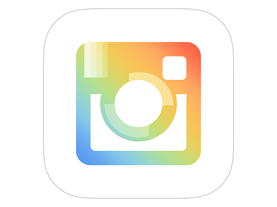
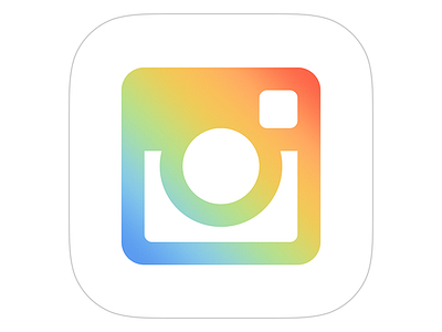
Revisiting my Instagram Icon Concept
As Instagram has released more apps, they've continued in a different direction for their icons. I'd previously posted a concept just using this gradient, but it's very obvious that they're quite deliberate with adding certain shapes to alter the gradient. I'm not entirely sure how that would look on the Instagram app icon, but here's my revised take.
More by Adam Selby View profile
Like

