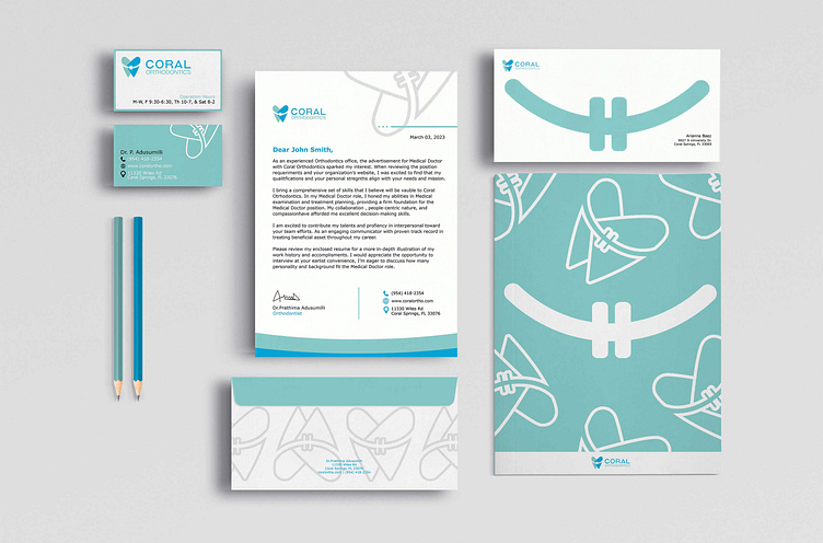
Coral Orthodontics
Coral Orthodontics is a local orthodontics in Coral Springs that is a growing business. Yet, they kept the same image for the last 14 years with no iteration since they first opened. Many of Coral Orthodontics’ competitors specialize in family or pediatric oral care. The new brand identity reflects its customers more inclusively. Therefore, this makes their treatment inclusive to patients with all different backgrounds and demographic characteristics. Their priority is to help patients smile confidently and ensure good healthcare.
Skills used
Branding
UX/UI
The problem
The current aesthetic does not represent the age group of their patients. If Coral Orthodontics only received young patients, I consider the current logo might have been a better match. Thus, in the redesign version, I considerate the different age groups.


