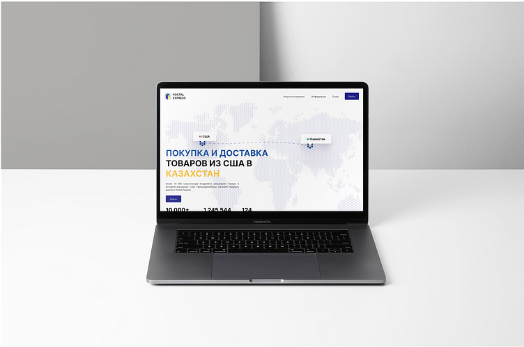
Postal Express Case Study and Redesign
Into
I've been using Postal Express, a proxy company that delivers items from the US to Kazakhstan, for years and waited for them to upgrade their design, but It never happened. I took it as a challenge to change their website, user experience inside the platform, and a brand new logo.
Logo
The old logo did not represent the company and its services — four different colors that do not match together in equal weights, and two different font styles. Overall, the logo needed a fresh look.
I've used a parcel box to symbolize their main service and added a more suitable color scheme with dark blue and yellow to match the Kazakhstan flag's colors. As a bonus, the logo looks like the letter "P".
Case Study
IMO, every design project should be a case study for a product designer to analyze, and make necessary design changes to solve the problem and make the users' lives easier.


