DesignTaught.Me
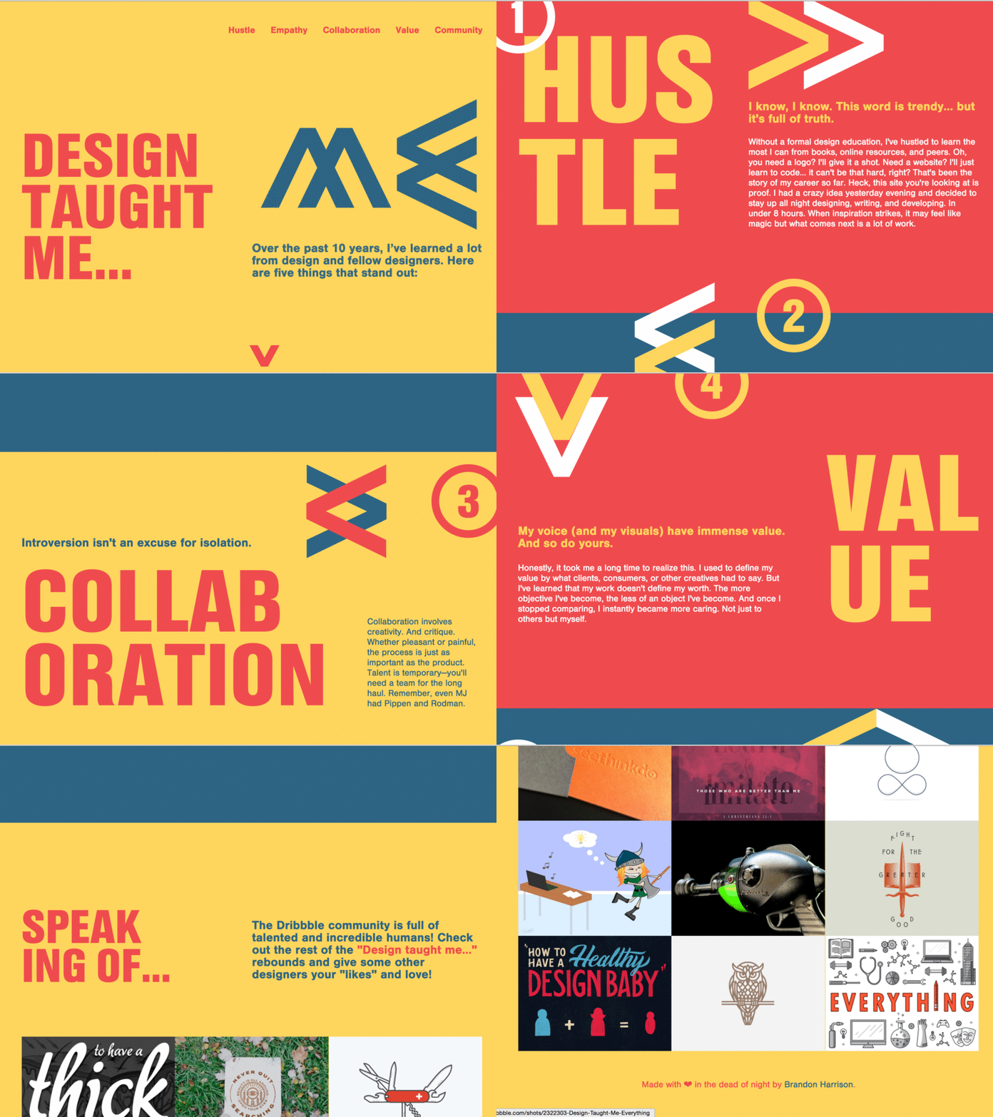
Ladies and gentlemen, introducing designtaught.me. My official submission to Shopify’s “Design Taught Me” competition.
I had a crazy idea yesterday evening when talking with @Brandon Sager about what to do for rebounds. And it hit me... What if I could design and develop a responsive website for this competition over night? I literally felt my gut churn the minute the words came from my mouth. Was I crazy?! I had 8–12 hours to write, design, and develop this thing from nothing. And I did it!
Here's the behind-the-scenes screen capture if you want to see my 8-hour sprint condensed to 5 minutes: https://youtu.be/Url7OxnbBU8
I knew a blank canvas would be hard to deal with and potentially paralyzing, so I strictly limited myself to a color palette and only HTMLS/CSS (no images allowed). I also decided to add some extra hustle by trying something new—flexbox. Since this was just for fun and I was strapped for time, I had to drop my cross-browser concerns and just go with something that would look great in modern browsers.
Everything was coded by hand (no frameworks) minus the non-design bells and whistles via jquery, animate.css, scrollTo.js, wow.js, and jribbble. Is it perfect? Definitely not. But that's another thing design has taught me—celebrate progression and don't always stress perfection.
