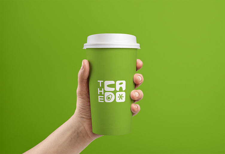
The Cado : Avocado Cafe | Logo
🥑 Introducing "The Cado" - A Haven for Avocado Enthusiasts! 🥑
Hello guys! 👋
Excited to share with you a recent design project close to my heart - the branding for "The Cado," a vibrant cafe that's all about the glorious avocado! 🥑✨
About
"The Cado": The Cado is not just a cafe; it's an avocado lover's paradise. From creamy avocado toasts to refreshing avocado smoothies, they're here to redefine your avocado experience. 🌮🥤
The Logo
🎨 Behold the heart of "The Cado" - the logo I had the pleasure of designing! Crafted with a blend of elegance and playfulness, the design features a crisp "The" and a bold, avocado-infused "Cado." The 'd' in "Cado" is a canvas for an intricately designed avocado, symbolizing the heart of their culinary creations.
Design Elements
🌿 Green Palette: Shades of green represent the freshness and healthiness of their avocado-based offerings.
🥑 Avocado Icon: The 'd' in "Cado" doubles as an artistic canvas for an avocado, marrying style with symbolism.
✨ Contrasting Typography: The elegant "The" sets the stage, while the bold "Cado" steals the spotlight with its avocado-inspired twist.


