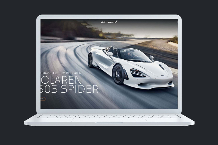
McLaren Reimagined: A Design Study
Enhancing the reputation of an iconic supercar brand.
Renowned for both their motorsport legacy and a varied lineup of supercars, McLaren stands out for providing some of the most dynamically proficient vehicles in the market. However, we believed that their website was not doing justice to the user experience. We took a swing at the website design and are pretty happy with the results of our design study!
The Challenge: McLaren's product range, beginning at approximately $200,000, is centered on pure performance. Regrettably, the McLaren website falls short of aligning with this premium price point and fails to embody the same philosophy as their exceptional products.
The Game Plan: A new website design aimed at accelerating the user journey. Our goal was for users to feel the speed of McLaren's cars right from the start, encountering a website that is significantly faster and more efficient to navigate.
The Outcome: Streamlined choices, a more effective user journey, all while elevating the brand's aesthetic. Users can now access the information they seek at unprecedented speeds and in record time.
It never ceases to amaze us at Always Fresh how frequently prominent, well-established brands maintain subpar websites! While we understand that larger brands may prioritize efforts elsewhere, particularly when their products practically sell themselves, we firmly believe that every interaction communicates a great deal about a brand's quality, attention to detail, and overall customer experience. It all begins with having an outstanding website.
Disclaimer: The McLaren logo and all associated images and assets remain the property of McLaren. The visuals created are for the purpose of a design study only and no copyright infringement is intended.
