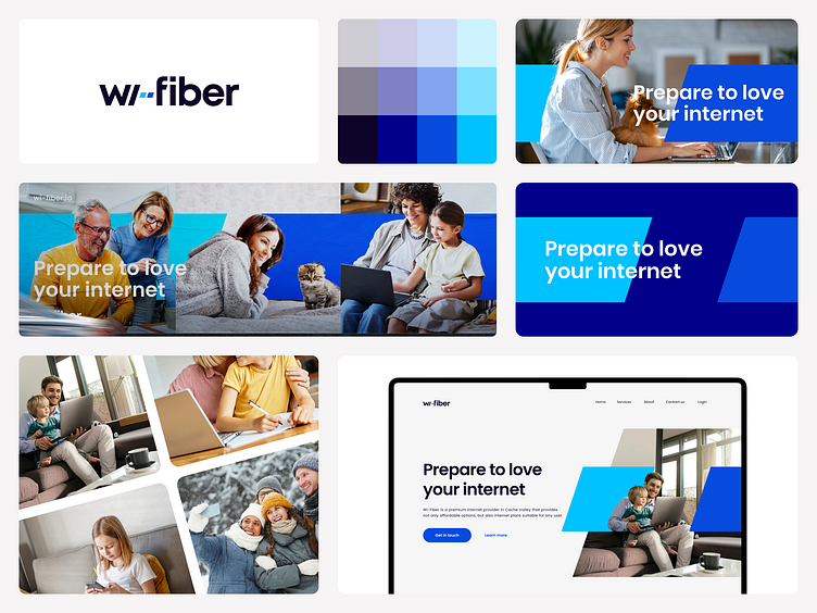
Wi-Fiber Logo and Branding
Utah-based Broadband provider reached out with a goal of rebranding their very dated look. They wanted to retain te dash in between the words and we had to accommodate for that. It sparked the idea of actually using that as the focal point of the brand and splitting it into a two-piece mark that would reinforce the brand while still being legible enough in the context of the logo.
Full-scope project coming soon at zdrale.me
More by Milos Zdrale View profile
Like
