Brand Identity for Space Company — Spaceflux
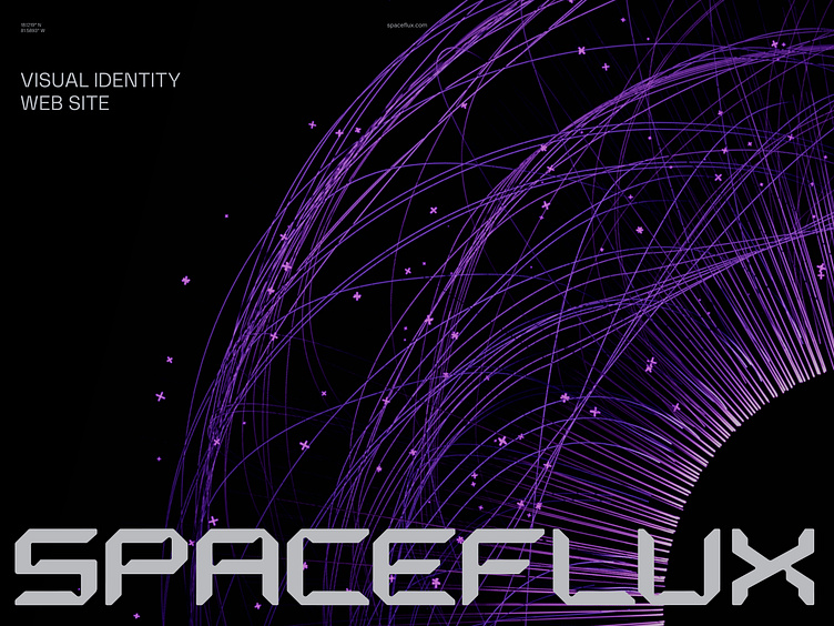
Type of design: Brand Identity and Web design
Specifics and business area: Aerospace Industry & Engineering
Client
2016, after colliding with space debris, the Iridium satellite fell to Earth. Space debris includes remnants of launched rockets, satellites, spacecraft, and other objects created by human hands. These objects move up to 28,000 km/h and can damage satellites or spacecraft.
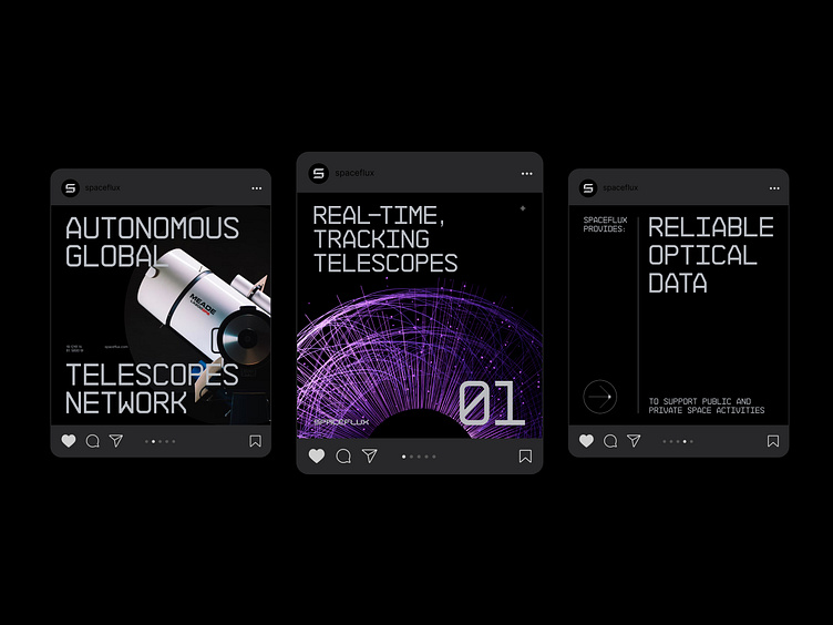
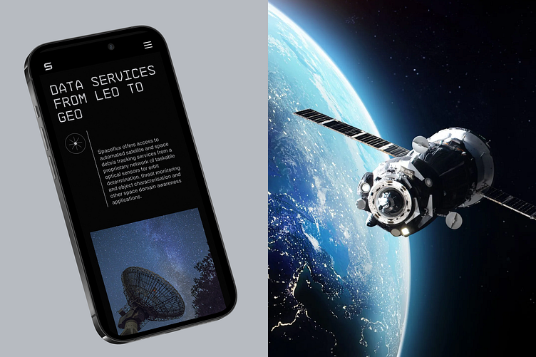
Spaceflux has a global network of optical telescopes that collect data on objects in space: satellites, space debris, meteoroids, and asteroids. Using artificial intelligence algorithms, Spaceflux, based on optical data, distinguishes debris from satellites and other objects from stars.
– Governments use Spaceflux data to monitor space debris and prevent collisions with satellites.
– Space agencies — to plan space missions and ensure the safety of astronauts.
– Space robotics companies use data to navigate their robots in space.
Design goals
We aimed to create a brand identity that conveys the project's value and technological aspects while helping it stand out among competitors.
Concept
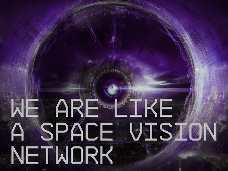
The human eye is an organic sensor that observes, captures, and absorbs large amounts of data from the world around us daily. Then, the brain converts these data streams into information. Similarly, SpaceFlux uses modern telescopes and AI technologies to collect optical information, identify, and track objects in space. One can compare SpaceFlux to an artificial eye that receives visual information and converts it into technical data
Graphic
The stylized 3D eye has become the main visual element of the identity. Inside the eye, we depict data flows in a linear style and surround it with objects symbolizing celestial bodies for a spatial effect. To make the graphic even more flexible, we can zoom in and look at small details as if through a telescope.
Additional elements
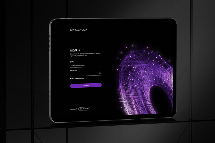
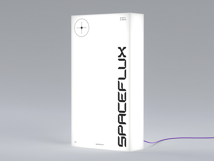
We use vertical and horizontal lines as decorative elements to create a more technologically advanced design look. These lines structure the content and serve as identifiers in layouts lacking three-dimensional objects. Additionally, we used mini-details in the GPS coordinates form and a sight to give the design a scientific character. Technological icons are used for navigation or to explain the functional advantages of the product.
We collect, identify, and track. Nothing escapes our view...
Our digital identity is a window into the depths of space through the prism of Spaceflux. While you are reading this case study, he is making sure that space is safe.