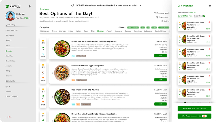
Prepify: Best Meal Prep Webtool
For the design of this project it took a lot of ux that was apart of understanding what are the painpoints in finding a good way to add meals while having it be easier to see what your adding to you
The creation of Prepify, an innovative web tool, was guided by an exhaustive UX process aimed at addressing challenges associated with effortlessly adding meals to a meal prep plan or cart, while enhancing overall user experience. This undertaking involved a meticulous examination of user pain points to ensure a streamlined and intuitive interface.
To initiate the design process, I curated a mood board, serving as a visual compass to encapsulate the aesthetic and thematic direction of Prepify. Subsequently, storyboarding techniques were employed to map out user journeys and interactions, providing a comprehensive view of the tool's functionality.
Wireframing played a pivotal role in translating conceptual ideas into tangible structures, allowing for refinement of layout and functionality before progressing to the prototype phase. This iterative process facilitated fine-tuning and optimization of the user flow.
Adherence to style guides throughout the project ensured consistency in visual elements, encompassing typography, color schemes, and design components. This meticulous attention to detail culminated in the creation of a compelling and cohesive design language for Prepify.
The goal throughout this one-week project was clear: to create the ultimate meal prep buying and setting up tool. This vision was realized through a strategic combination of design methodologies and practices, capitalizing on a dynamic environment that fueled creativity and efficiency.
The experience of guiding Prepify from inception to completion was profoundly rewarding. I take pride in delivering a solution that not only addresses user needs but also exemplifies a harmonious blend of functionality and design, establishing Prepify as the ultimate meal prep companion.
