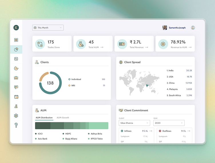
Analytics Dashboard for Finance Data Visualisation
Introducing a breath of fresh air in financial analytics – our latest UI design for Kinntegra, tailored for Independent Financial Advisors (IFAs). This dashboard encapsulates a wealth of data through a serene, pastel palette that makes number-crunching look like a breeze.
From trades to total assets under management (AUM), every metric is a drop of clarity, encapsulating the ebb and flow of financial tides in soothing hues. It's more than a dashboard; it's a calming retreat for IFAs, where insights sprout amidst a harmonious blend of colors and figures.
Liked our work? Connect with us on: Website | Linkedin | Instagram
ProCreator - Global UI/UX Design Agency
Where Design Meets Impact for Every Business Scale.
More by ProCreator - Global UI/UX Design Agency View profile
Like
