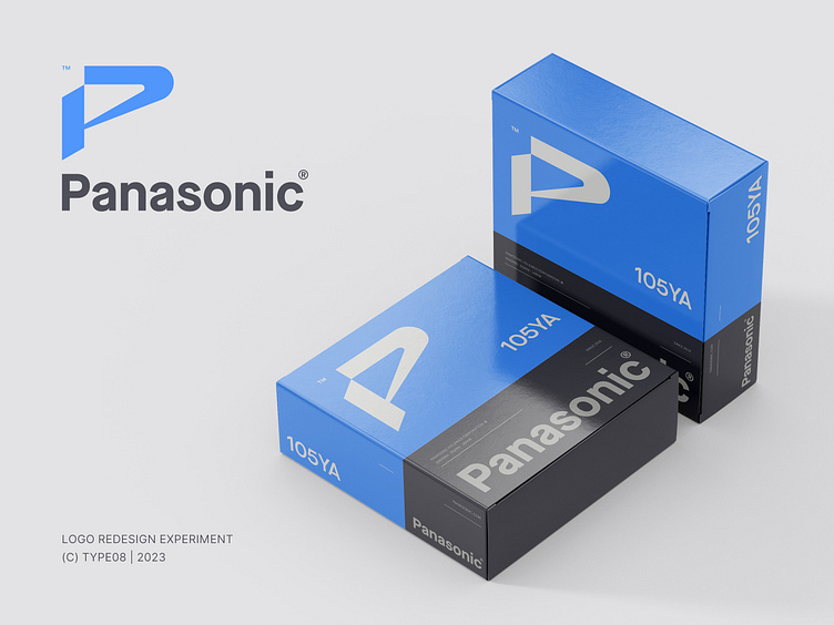
Panasonic Logo Redesign
In my (re)branding exercises I'm often trying to find and play with brands that maybe need just some TLC instead of a huge overhaul. This time I'm refreshing Panasonic and its legendary wordmark, but I also think that they could benefit from a strong logo symbol as well. This lettermark P is playing with perceptions, dimensions and vibrations inspired by the audio and video niches that Panasonic is covering. Future meets retro with some subtle nods to Japan(ese). Let me know what you think! :)
✉️ > For project inquiries, feel free to reach out directly: type08@gmail.com
Cheers!
More by Type08 (Alen Pavlovic) View profile
Like
