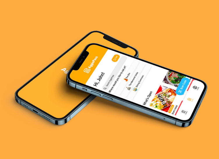
UC Davis AggiePass App
This is a UC Davis Aggie Rewards App my team and I created for Design Interactive, a UI/UX organization on campus.
CONTEXT:
UC Davis has a multitude of food options, from the Coho, to the Silo, to dining halls, and food trucks. We want to create an exciting digital platform that rewards current students for visiting their favorite on-campus dining spots.
PROJECT TYPE:
Mobile Application Design with Figma
DATE
September 2023
RESEARCH
GOALS
Understand User Preferences
UX Assessment
Reward System Optimization
User Engagement & Retention
METHODS
Competitor Analysis
Usability Testing
Prototype Testing
UCD Student Interviews
RESULTS
Based on data gathered during UCD student interviews, we identified key trends and patterns related to on-campus dining.
PAIN POINTS
Students expressed that there is not an accessible and convenient platform to access information for dining at UC Davis. We also discovered that there was a lack of motivation to encourage on-campus food purchases, and this helped us recognize the importance for a digital platform.
OUR GOALS
Utilize a reward system based on user preferences
Utilize rewards to encourage users to save and earn exclusive offers with point system
Loyalty program, discounts, exclusive offers, etc.
Reliable and easy to use application for finding nearby food locations on campus
Aimed to create a digital platform that is both appealing and sustainable for long-term user engagement
We began by creating a User Persona based off our data to get a better understanding of our potential users.
Using this information and other research, we began to ideate for a User Flow that would match what UCD students are looking for in a campus dining app.
We began creating a UI Kit for our app. We used a different color palette than what is commonly associated with UCD in order to make it stand out, however, we still utilized the UCD's font to maintain some identity to the school.
We then began crating our Mid Fidelity Design for our app and testing which features would be best to include.
And this is how the final Log In Page looked:
TAKEAWAYS AND NEXT STEPS
What We Learned
I learned to identify preferences among UCD students regarding on-campus dining, as well as to recognize pain points in existing digital platforms
If There Was More Time and Resources
Looking back, I believe we could have conducted more in-depth interviews and surveys. Along with developing multiple iterations of the digital platform prototype and implementing A/B testing for different reward system prototypes
What We Would Improve On
We would want to ensure a more diverse and representative sample in our user research. As well as conduct a more comprehensive usability testing for the digital platform and reward system.


