Smooth Sailing Logo

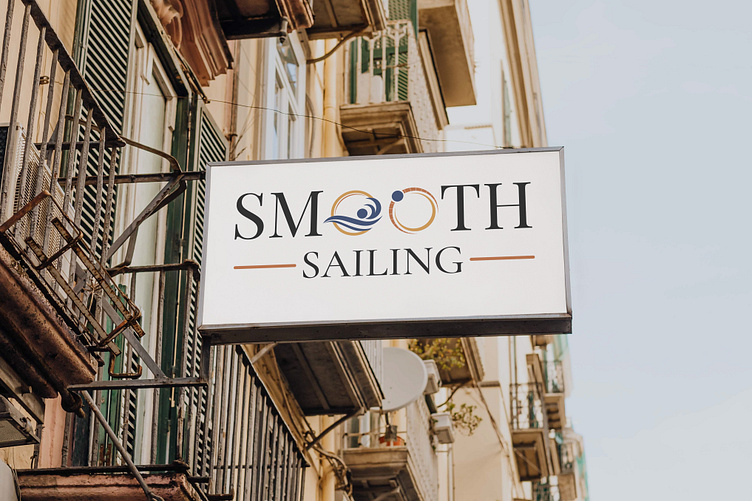
The Smooth Sailing logo embraces a minimalist approach with subtle wave-like elements integrated into the typography, notably in the form of smooth, curved lines or possibly within the letter "O," resembling rings or undulating waves. The design aims to convey a sense of fluidity, movement, and the calmness of the sea. The incorporation of these wave-like elements signifies a connection to the ocean and a serene, effortless journey, complemented by a typography style that may include sleek, modern fonts or gentle curves to harmonize with the logo's minimalist theme. The color palette might lean towards soothing blues, whites, or gradients to evoke a sense of tranquility and the open sea, capturing the essence of Smooth Sailing's brand identity through its subtle yet evocative design elements.
Linkedin : linkedin.com/in/marshalldenhas
Behance : behance.net/ashell101