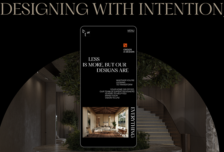
Web design for between the walls studio
The site grid is based on the structure ofof the logo of the Ukrainian company between the wallsDotted lines look light and do not overload the composition.We also used large typography with the addition of outline letters to create a more interesting and attractive structure.The website turned out to be aesthetic and restrained, whichfully meets the task at hand.We also createduser-friendly adaptive versions while maintaining the style and our structure.Are you interestedin cooperation?Contact us to turn your idea into a powerful tool!
More by Anhelina Ozumok View profile
Like
