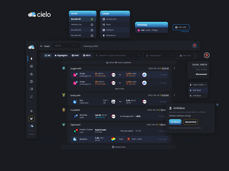
Cielo: CICD Product Design - Feed Page
Feed Page Design Requirements and Planning
This page started out with a briefing session and a guide to what competitors were doing, and how they were solving design problems involving displaying wallet tracked alerts data for their users.
What are we building?
A Feed page of alerts data that is taken from the user's Customise page and all the wallets they have saved as alerts on their phone using the Trackerbot tech from the backend.
1. Design Challenge
There are so many different kind of transactions, and they are always being newly created as new DeFi instruments became available on multiple chains.
So, we needed to find a way to present them all uniquely, so the user can easily recognise what they are looking for while skimming the web app feed.
2. Solution Ideation
To accommodate for the countless combinations of tx types I went to work working out a Formula.
This formula was meant to reduce the complexity of design and mitigate the bottleneck design could present in introducing new tx types timeously in the backend.
3. High Fidelity Latest Version
In the end, this Feed Card Item was the result of a lot of feed back and design iterations and is the item that was most tailored to fit the app dashboards continuity style and UX.
See more about this process - go to end of the page here - https://www.behance.net/gallery/153895289/UIUX-Case-Study-Cielo-Onchain-Social-Feed-Analytics
