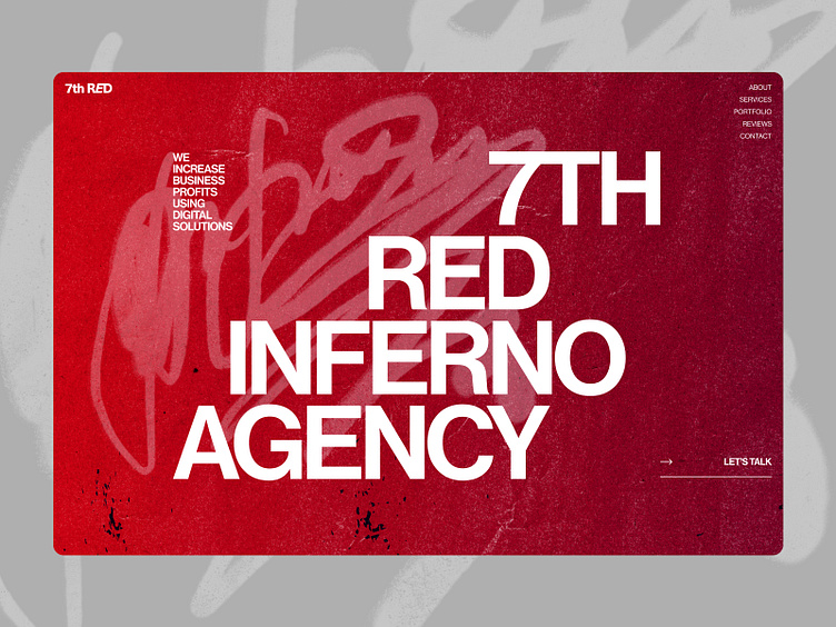
Landing page for Digital agency
Hi, Dribbble 👋
I'm happy to share with you the design of the first screen landing page for a digital agency. The task was to create a creative design that would be different from competitors and attract the attention of users. The texture of the worn paper in red color is related to the name of the agency.
Don't forget to click ❤️ if you liked it.
I'm open to new projects in different niches.
Let’s discuss your project:
You can find me here:
More by Viktoriia Pashkovska View profile
Like
