HOLA - Logo Redesign

I redesigned the logo for Heart of Los Angeles (HOLA), When I started I knew it had to be more than just visually appealing—it needed to resonate with the community HOLA serves and reflect the organization's mission. Here's a peek into my design process:
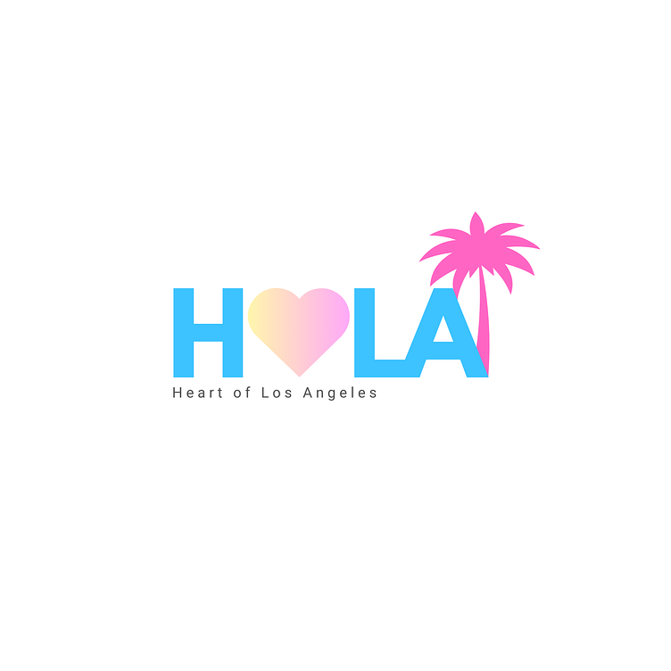
From Sketches to Final Concept: I started with a series of sketches, experimenting with elements that represent HOLA's essence—the welcoming nature of "Hola," the love for community, and the ever-present LA palm trees. These sketches were rough but crucial for me to explore different directions without the pressure of getting it right on the first try.
Balancing Act: In the final design, I aimed for a balance that would make the logo approachable yet professional. The wordmark needed to be bold to stand out but also convey a sense of welcoming warmth.
The Final Design: The outcome is a logo that features a heart at its center, symbolizing HOLA's commitment to nurturing the heart of the community. The palm tree is a nod to the city's landscape and represents growth and resilience. For the color palette, I chose a sunrise to sunset gradient to mirror the optimism that HOLA brings to its community.
Take a look at the initial sketches and the final design. I'd love to hear your thoughts and feedback!
