Mattress Review Card
Task
We saw losses on CTR on the latest test experience for all devices and are hoping to understand what information users need to make an informed and intentional click to purchase a mattress.
Current design
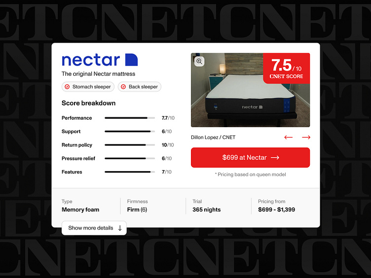
While the current design does a good job at maximizing the number of product review cards that can fit on the screen at one time a lot of potentially information was hidden behind an extra click that expands the card. From this our team did user research to determine what information users needed in order to make a purchase decision and ensured the necessary information was visible on page load, and any information that was not important stayed hidden behind the accordion. Most importantly the price and button to purchase the mattress were now visible on page load to users with the newly designed product review card.
New design
Our team did user research to determine what information users needed in order to make a purchase decision and ensured the necessary information was visible on page load, and any information that was not important stayed hidden behind the accordion. Most importantly the price and button to purchase the mattress were now visible on page load to users with the newly designed product review card.


