Case Study - Airline Website Desktop

The case study is a part of my university project (UX Design Institute accredited by Glasgow Caledonian University) consisting of research, analysis and concept blocks that are ultimately applied in my interactive prototype. The project's objective is to identify current existing pitfalls and create a software that would provide solution.
Research
Competitive Benchmarking
Goals:
For this project, I was investigating four common airline websites in the UK to learn how these organisations:
solve the same problem
establish what conventions are followed
understand how a prototype should look like and feel
Scenario:
Took book a flight from London (any airport) to Copenhagen . I took plenty of screenshots starting from the homepage and finishing with extras to highlight aspects that should be improved or oppositely would appeal user's attention.
Outcome:
Positive aspects:
The difference between fares is clearly communicated
The cheapest price for every single date is seen on the calendar
Luggage services are visualised
The locations is automatically identified
Pain points:
Too much advertisements
Unnecessary options e.g. hotels, car rental are appearing before the main booking process
Buttons merging with fonts
Customers are not warned about transits
Tools:
Microsoft PowerPoint Presentation


Final conclusion based on all 4 four websites investigation
Note-Taking
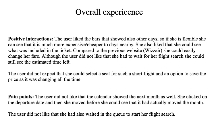
The project required to observe how two users interact with the same software they have never used before. It was important to pay attention to every detail. By understanding user's needs and struggles, I was able to identify on what aspects to focus when creating my prototype and how I could improve/prevent existing issues. At the end of video recording, I summarized all key points to consider as well as put down suggestions form user’s perspective.
Goals
Identify user's goal, behaviour, mental models, consider positive interactions and outline pain points.


Usability Testing
In order to get more research, identically to the Note-Taking project, I ran a video session with a friend of mine by giving her 2 airline websites to see how she interacts with them.
Goals:
encounter what are the potential software drawbacks and why on contrary customers keep using it
focus on what the user says
observe how quickly the user can find what is needed, whether the way the website is organised is understandable for the user and creates pleasant experience
Tools: Zoom
Testing Websites: 'Wizz Air' and 'TAP Air Portugal'

Analysis
Affinity Diagram
Goals:
Organise and classify raw material (gained from the research projects) into certain groups and categories
Outline positive and negative aspects altogether, in order to identify key issues
Additionally, in order to get more data, I collaborated with another student where we shared our data and expended our findings
Tools:
Miro


Customer Journey
Based on note-taking project and usability test, I created a customer journey map to build a better understanding of how customers find and interact with the service as well as to discover opportunities for improvement. The pain points were clues for creating my sketches and prototype. The map revealed many user problems and opportunities at the consideration and loyalty stages of the customer journey. The journey map covers the starting process (accessing homepage) and continues to extras.
Goals:
Find out, in what aspects users struggle the most and on contrary, what has been done correctly, so I could understand what conventions to follow
Understand user's goals, context, behaviour
Summarize positive aspects and pain points. User's suggestions were also taken into account
Tools:
Miro
https://miro.com/app/board/uXjVPpzul6k=/?share_link_id=832372721588

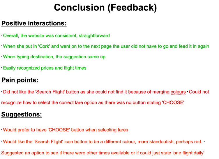
Most painful areas: Date Selection, Fare Selection
Positive aspects: Destination Input, Adding Baggage and Extras
Areas that require consideration: Homepage, Flight Search (Timetable)
Concept
Flow Diagram
Before creating my first draft, I had to thoroughly visualise how users would go through my website. The journey of a user flow starts from the homepage and ends at the payment section. The quadrangles stand for every stage the user has to go through and describe what kind of tools and services are located in it. The information in circles refers to steps the user has to take in order to proceed further.
Goals:
Proposed what kind of information will be located in each section
What steps are mandatory and should be completed in order to proceed to the next stage. The journey of a user flow starts from the homepage and ends at the payment section.
Tools:

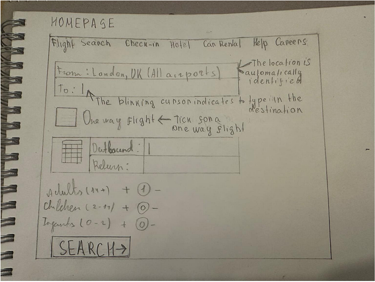
Interaction Design for Desktop (Sketches)
Once I have created a user workflow, I started sketching how my potential website would look like, starting with the homepage and concluding with the payment section. I decided to sketch it with a pencil, so I could easily amend and adjust. By creating sketches of my prototype by pencil I already knew how it would look like, so only had to make it look digital and interactive.
Tools:
A5 paper and pencil

Design
Prototype for Airline Website
Once I have finished drafting my preliminary version of the website, I converted sketches into digitalised version and my prototype interactive. It was important to ensure the adheres to the best user's practice.
Tools:


Annotations
After building my prototype I provided a guidance on how the software behaves. It is noticeable that I have followed already established conventions in order to ensure the software is practicable, understandable and easy to use.
Tools:
Figma


