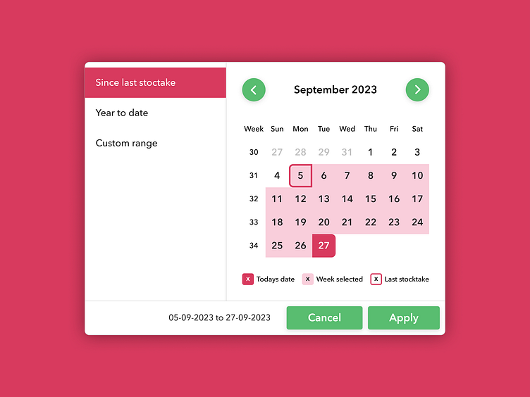
Calendar with week selection
Date pickers are a fundamental component in digital solutions dealing with data. In this project, we encountered the challenge of creating a date picker that not only allowed users to select a single week but also facilitated the selection of week ranges. Additionally, we aimed to provide users with shortcuts to swiftly choose dates since their last stocktake or year-to-date.
Research & Inspiration
The journey began with a research phase where I scoured the internet for existing calendar UI designs. During this exploration, U stumbled upon a remarkable blog post by Set Product on calendar and date picker UI design (Check it out here: Set Product Blog). Inspired by their insights, U set out to create a user-friendly date picker that met our project's unique requirements.
Adopting React Datepicker
To bring our vision to life, we drew inspiration from the React Datepicker component. What particularly resonated with us were the convenient shortcut links provided on the left-hand panel. We decided to adapt and incorporate these shortcuts into our design to enhance user efficiency.
Shortcut Features
Since Last Stocktake Shortcut:
This shortcut enables users to select all dates between the current date and the date of their last stocktake. It streamlines the process of choosing relevant dates for stock management.
Year to Date Shortcut:
Users can effortlessly select all dates between the current date and the 1st of January in the current year, simplifying the year-to-date date range selection.
Custom Range:
For more tailored selections, users have the option to choose either a single week or a range of weeks. To clarify the week selection, we introduced a checkbox next to each row, which highlights the selected week upon interaction.
Enhanced Visualization
To provide users with comprehensive visibility of their date range selections before finalizing their choice, we included a date range summary at the bottom of the component. This summary is presented in a number format, offering users two distinct ways to visualize their selected date range before clicking the 'Apply' button.
Outcome
This intuitive date picker design successfully addressed the project's objectives, making date selection a seamless experience for users. With shortcut links and enhanced visualization, we have empowered users to select the date ranges they need efficiently. By drawing inspiration from industry-leading UI design principles and components, we created a solution that not only met but exceeded user expectations.
Want to work with me?
If you're interested in collaborating or learning more about my design process, please feel free to reach out to me at hello@designbyend.com.


