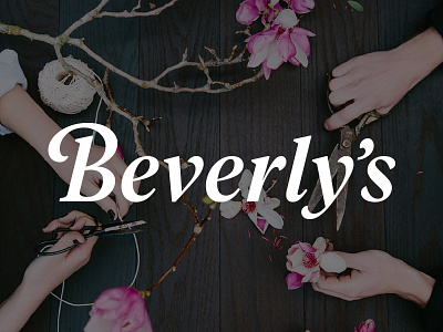
Beverly's Logo
A family of community-based craft and fabric stores, Beverly's brand has grown organically since 1968. Now with 19 locations, they came to us with a desire to unify the branding and messaging across the entire company.
Their new wordmark needed to convey a number of elements including a fun and playful nature, a feminine feel without excluding their male customers, and the maturity and professionalism of a nearly 50 year-old regional company.
View the full case study here.
More by Cosmic View profile
Like

