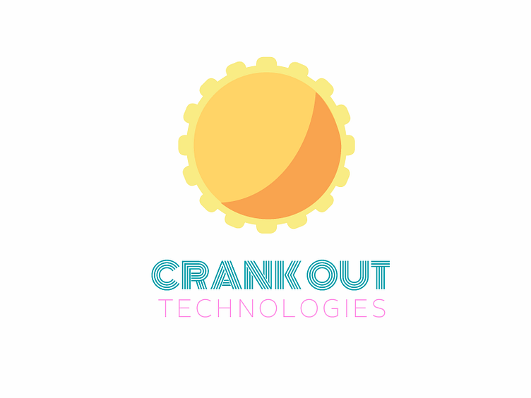
Crank Out Logo
The startup that almost was. Based in Miami, the logo and color choices are meant to evoke the spirit of the vibrant city.
The teeth on a crank double as the rays of the sun. Being a technology company, the sun's surface references a button; don't you just want to press it? You know you do.
The pictorial would serve as a favicon on a marketing website. In applications, it could serve as the link to a menu or home screen.
The wordmark is inspired by Miami Vice and Art Deco. Had the project continued, I would have expanded the arm on the T in the word `Out`. Alas, she was not meant to be. What would you change?
¡azúcar!
More by Ariel Jatib View profile
Like
