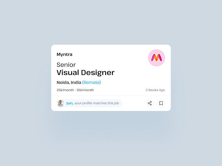
Job Portal Interface UI Card
Creating a UI card for job seekers, we've prioritized the display elements. The company name, posted in the top left corner, takes precedence, accompanied by the company logo on the right side. Following that, we present the job hierarchy, such as senior, junior, or lead, along with the designation. Next, the location of the job and details about the work structure, such as work-from-home or office, the salary range, and the job posted date.
Crucially, we include the job seeker's profile matching percentage, prominently placed in the bottom area after presenting all the details. Additionally, we offer convenient options for sharing and saving.
This UI design is ready for use in job portal interfaces.
Have an App idea? Want some expert help for your next project? Write to us: rishabh@tecorb.com, Sales@tecorb.com Discuss your requirements (Free Consultation) at : https://www.tecorb.com & What's App: +91 9910781148


