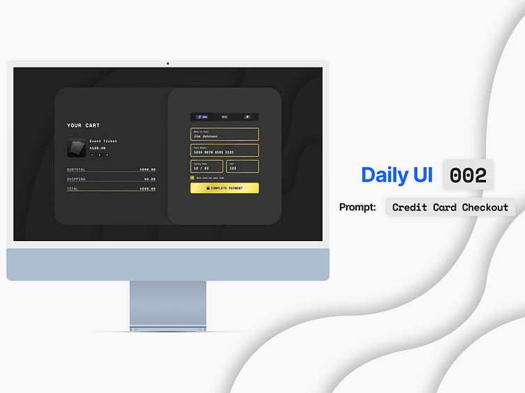
Daily UI 002: Credit Card Checkout
I've been finding myself inspired by Apple's latest paper cutout design I've seen them using, so I wanted to have a go at making it myself.
I decided to design for dark mode this time, and used gold as the highlight colour. I'm still undecided on if I like the gold gradient or if I think it's tacky. Can I choose both?
More by Adam View profile
Like
