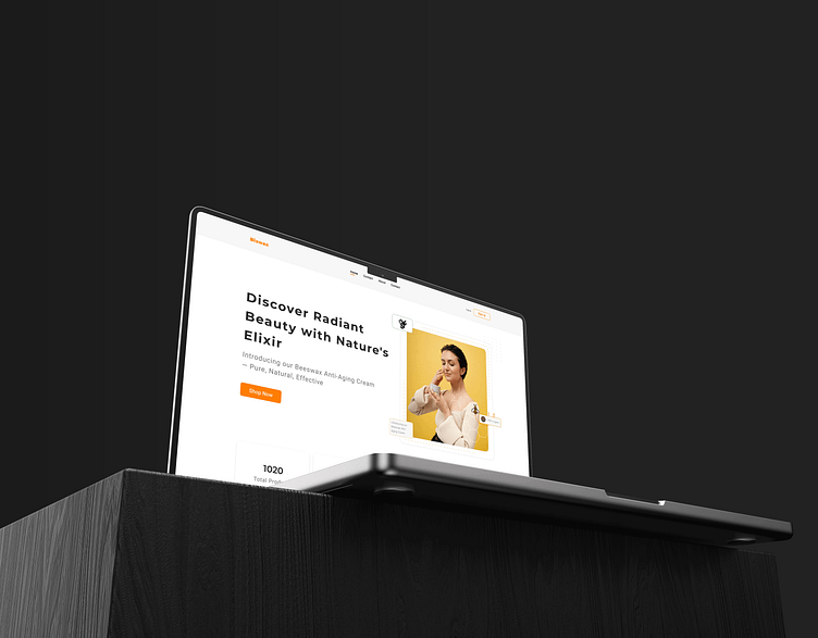
Bizwax Skincare Landing Page
Project Description:
Embark on the journey of transforming skincare experiences with the redesign of Bizwax's Landing Page. 🚀 Dive into the intricacies of addressing user pain points and crafting a seamless user journey.
Problem Statement:
Our initial challenge was a cluttered and confusing user interface, hindering the user's journey to discover the beauty of Bizwax Products. The pain point was clear: users struggled to navigate and understand the offerings, impacting their overall experience.
Solution:
With a meticulous approach, we embraced minimalism in design, stripping away unnecessary elements and focusing on clarity. The redesigned landing page now guides users effortlessly through the product offerings, emphasizing the essence of locally sourced beeswax and botanicals.
Key Features:
Clean Interface:
Minimalistic design for enhanced clarity and ease of navigation.
Product Spotlight:
Highlighting the flagship product, Neva Bar, with immersive visuals.
Storytelling Section:
Unveiling the brand's journey and commitment to beauty.
Interactive CTAs:
Thoughtfully placed calls-to-action for a seamless user journey.
Style Guide
Full page
Available for work Inquiries - naeemmia087@gmail.com
🧚🏻♀️Set your free consultation 👋🏻 WhatsApp: +880185535217
#MinimalDesign #SkincareUX


