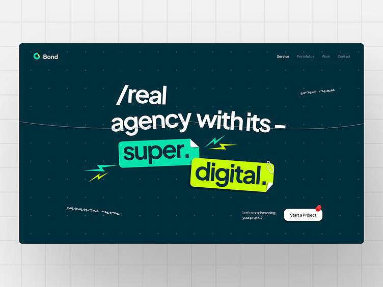
Bond - Agency website
Hello Dribbblers!👋
I'm excited to share my latest landing page design exploration! It's been a journey of creativity and innovation, and I can't wait to showcase what I've come up with!
Welcome to Bond!
For this design, I got inspired by the fun and colorful look of sticky notes and the lively vibe of wall magazines.
Imagine the way sticky notes bring color and order to your desk—my design aims for that same lively and organized feel. I used bright colors and a flexible layout, just like how sticky notes can be arranged in different ways. Each part of the design is like a quick note, keeping things simple and attention-grabbing.
Full page preview
What do you think? Feel free to share your thoughts in the comments!
Don't forget to "Press L" if you like it! ❤️
We are available for your awesome projects! Affordable and satisfaction guaranteed. Just shoot us an email at info@slabdsgn.com and let's chat on Whatsapp
------------------------------------
Check our product 🚀
Creative Market | Envato Elements | UI8
Follow us for more cool stuff ✨


