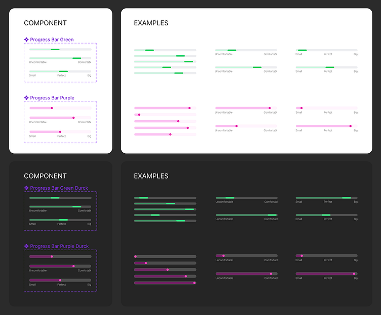
Variable Auto Layout Progress Bar
А flexible and user-friendly way to customize progress bar lengths in your UI designs.
Key Features:
Multiple types of progress bar components to choose from.
Each type available in both light and dark themes.
Simple adjustment for progress bar lengths.
Intuitive design for quick modifications.
Instructions for Use:
To adjust the progress bar on any component instance, start by double-clicking on the 'Progress' layer. This gives you access to the main settings of the progress bar.
Inside, locate the 'Spacing between items' setting. Adjust this to change the length of the progress bar according to your design requirements, as shown in our example below.
Included various types of progress bar components in this project, each available in both light and dark versions, to ensure versatility and adaptability to your specific UI design themes.
This project is designed to make your design process more efficient and adaptable. Explore the examples below for practical demonstrations, and feel free to use these features in your designs!
Start by double-clicking on the 'Progress' layer. This gives you access to the main settings of the progress bar.
