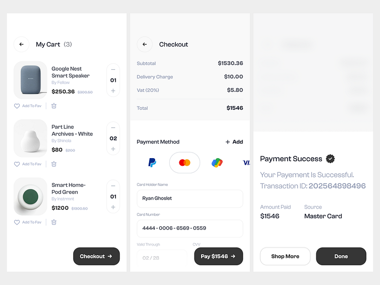
Payment Journey: From Cart to Confirmation
In this design showcase, witness the seamless flow of a user's payment journey through three pivotal screens—Cart, Checkout, and Confirmation.
Have a project? have a chat!
Email me at uxmushfq@gmail.com or DM me at Instagram.
More by Mushfiqur Rahman View profile
Like
