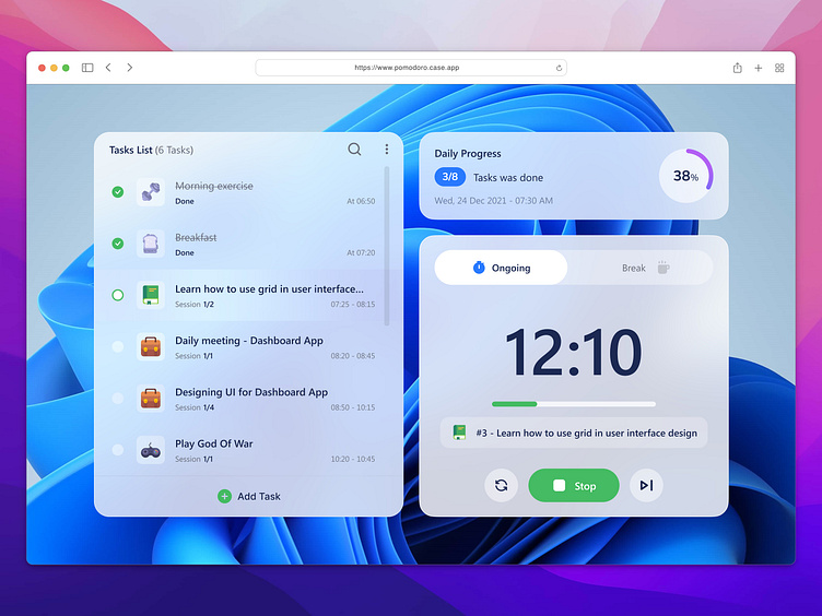
Pomodoro Web App
What is The Pomodoro Technique?
The Pomodoro Technique is a way to manage your time and stay focused on your work. You divide your work into 25-minute chunks, followed by a 5-minute break. After four chunks, you take a longer break of 15-30 minutes. The goal is to concentrate during the 25 minutes and take breaks to stay focused and prevent burnout. The technique gets its name from an Italian timer shaped like a tomato, called a "pomodoro."
Design Process
I completed the projects in two weeks, dedicating 10 days to the design process. The tasks involved mini-research, ideation, creating visuals, and prototyping, as outlined below.
User Persona
Competitor Analysis
Here are some key takeaways and potential areas for improvement.
Design System
In this project, I created a design system from the ground up to ensure consistency and efficiency in my designs. This system also played a key role in achieving a unified look and feel throughout the application.
High Fidelity Design
Home Screen
I designed the page to give users a straightforward and easy experience. With a clear Home screen, you can quickly see all the actions available – adding a task, starting one, taking a break, or checking your daily progress. The design focuses on simplicity and user-friendly interaction, making it easy for you to navigate the app and stay engaged.
I've crafted a seamless process for adding tasks. Simply click the "Add Task" button, and voila! A user-friendly pop-up appears, allowing you to effortlessly input the task title, choose its category, add a description, and set the total session length. The interface is designed to make this a breeze, ensuring you can complete these steps and create your task in a snap! 🫰🏻✨
You have to fill in both the Task Title and Task Category. If you forget, don't worry! The system will remind you with an error message, so you can quickly provide the necessary info and move forward smoothly. Easy, right?
Tasks List
I designed this to make managing tasks super easy. After you add tasks, find them on the left in the Tasks List. It helps you see what you've finished and what's left. When you're ready, hit "Start," and a 25-minute timer begins. Your tasks go one after another, but feel free to skip or restart the timer anytime. It's all about making it work for you!
Task Detail
The design was carefully chosen to give you effortless access to task details. Just double-click on the task, or hover over it and click the 3-dots button. It reveal a set of options for various actions you can perform on the task. Simple and handy!
This approach prioritizes user convenience, providing multiple pathways to view and manage task details according to your preference.
Edit and Delete Task
When you need to tweak a task, simply hover over it and click the 3-dots button. Select 'Edit Task' for a comprehensive editing experience. Alternatively, for a swift edit, swipe right on the task and hit the green button. This dual-option approach ensures that users can effortlessly modify tasks according to their preferences, making the editing process both intuitive and efficient.
What about if you want to delete a task? No problem! Just swipe left and tap the bright red button. A confirmation will pop up to make sure you really want to delete it. Confirm, and the task is gone!
Daily Progress Bar
The design choice for the daily progress bar allows you to easily gauge your progress by showing both completed tasks and the percentage of overall completion. It provides a clear visual representation of your accomplishments and what's left to do, giving you instant insight into your daily productivity.
Searching Task
When you have a bunch of tasks to tackle, searching for a specific task can be a real lifesaver. All you have to do is simply search for the task's title and voila! You're on your way to getting it done.
Break
This feature crafted to prioritize your well-being and productivity. By encouraging a short 5-minute break after each task, the design aims to give you moments to recharge and maintain peak performance. And, every four tasks, treat yourself to a longer 30-minute break. It's a simple way to recharge and stay productive!
You can easily start or stop a break whenever you need to. Simply press the appropriate button, and you're good to go. Don't worry, the app is smart enough to distinguish between short and long breaks, so you can relax and enjoy your time off!
Key Learnings
Here are some key learnings that I gained from designing this project.
📩 arfianmaulidan@gmail.com


