Urbanity - Branding Guide
Hi Folks!
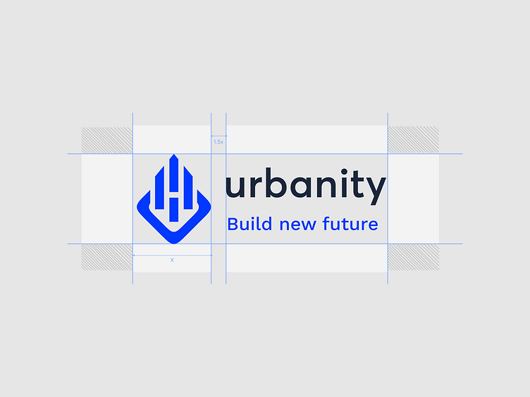
I want to share my visual brand identity exploration here, and it's called Urbanity. I've chosen brown as the main color to resonate with the brand, symbolizing home design. Given the current popularity of Scandinavian design, which often incorporates brown hues, this choice aims to capture that aesthetic. For the logo, my inspiration comes from flats, symbolizing house construction.
Hi Folks! 🔥
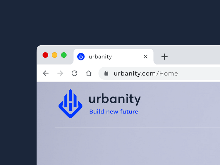
I want to share my visual brand identity exploration here, and it's called Urbanity.
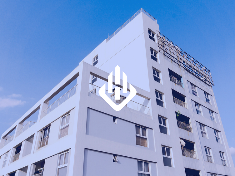
The idea of this concept is to make it look like a premium construction building agency.
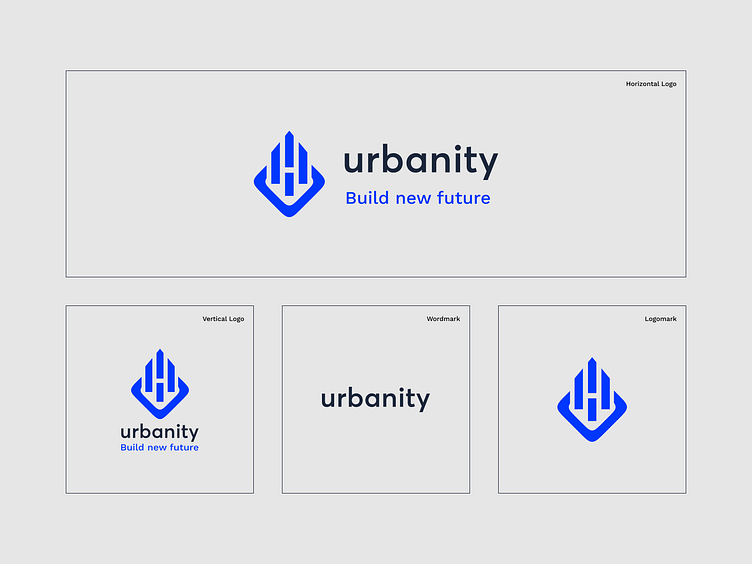
The logo is based on the letters U and is like a Building or Skyscraper.

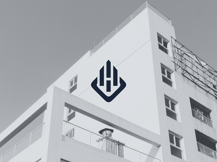
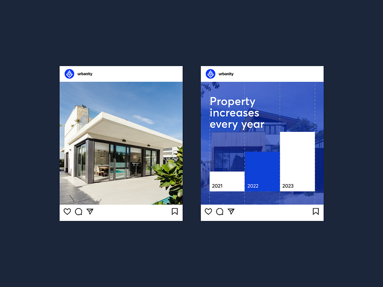
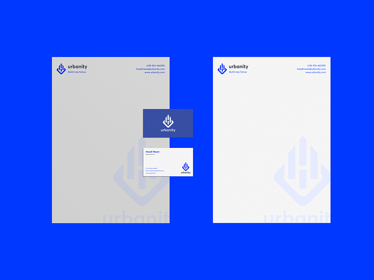
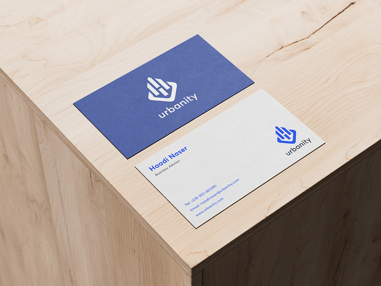
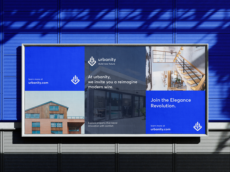
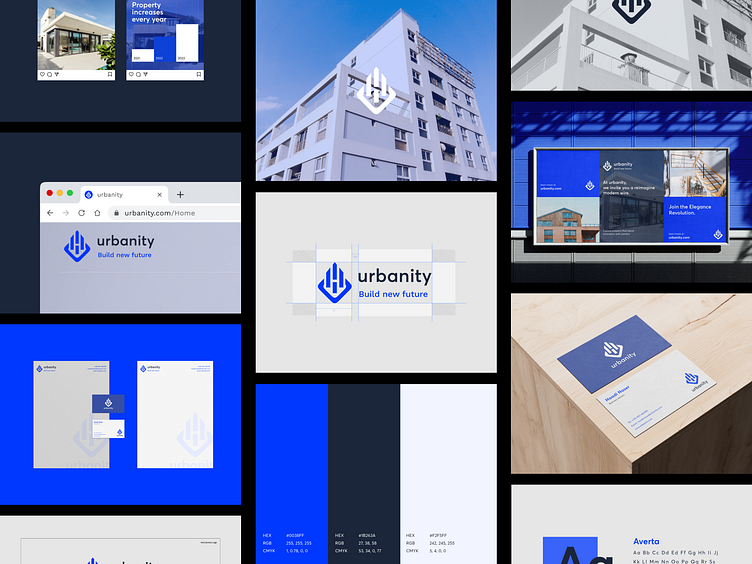
Mockups 🔥