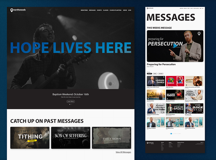
redesign concept: northwoods community church
Well hello there!
For some practice, I decided to redesign a local church's website. The site is clunky and outdated. on top of that, the site is also hard to navigate and find what you are looking for and know where to go, especially if you're new.
I wanted to make it fresh modern and easy to use for staff and members of the congress alike. I still used the church's brand colors and fonts to keep it consistent with the rest of their marketing.
This is all just a concept for fun and practice, but let me know what you think.
Thanks!
More by Tanner Vote View profile
Like


