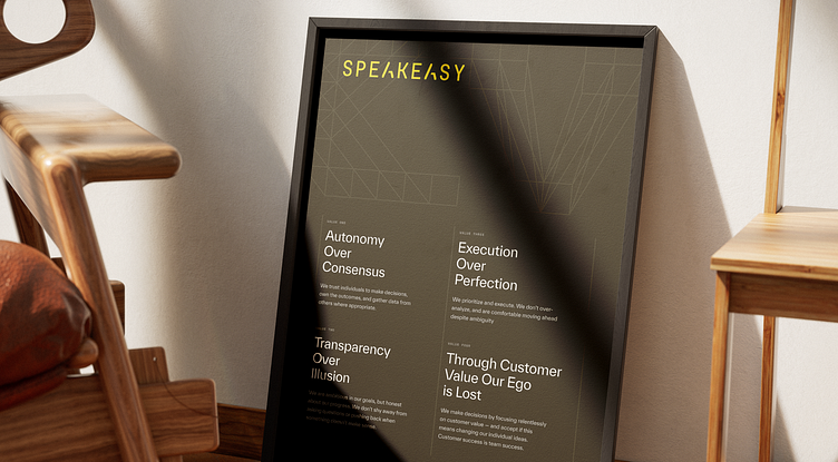
Speakeasy Visual Language
Using yellow as a primary color is almost a refresh of the previous Speakeasy identity, which allowed us to carry over a bit of brand equity while avoiding the categorical clichés.
We paired it with an off-black for high contrast, along with more warm-leaning neutrals. We settled on Everett for the typeface, a somewhat standard sans serif, but with its sharp angles and drastic cuts it feels technical in all of the right ways.
Check out the full Speakeasy case study: https://odibrand.agency/work/speakeasy
---
Looking for a brand agency? We would love to hear from you.
Email us: hello@odibrand.agency
Our Website / Instagram / LinkedIn / Twitter
More by Odi Agency View profile
Like


