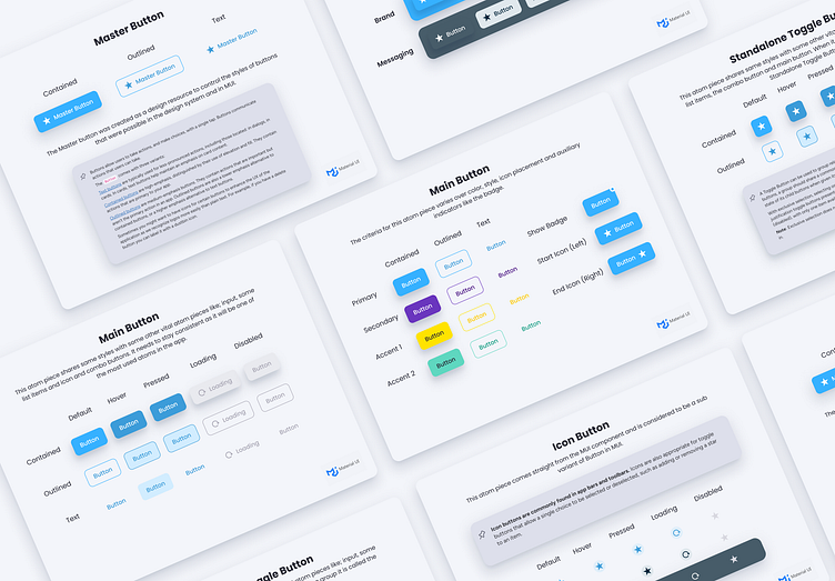
Playroll Design System - Atoms Buttons
Atoms are pieces of the Design System that are the most commonly used pieces, one of those is Buttons.
All these Atoms are modelled off the Material UI Component library and have been loosely categorized in the same system as the library.
Here is a list of all the Button Stories, and what were composed with their equivalent MUI component (just for designers! ;) ):
Button
https://mui.com/material-ui/react-button/#basic-button
Inverse Button
https://mui.com/material-ui/react-button/#basic-button
Icon button
https://mui.com/material-ui/react-button/#icon-button
Toggle Button
https://mui.com/material-ui/react-toggle-button/#standalone-toggle-button
https://mui.com/material-ui/react-toggle-button/#exclusive-selection
Split Button
https://mui.com/material-ui/react-button-group/#split-button
Floating Action Button
https://mui.com/material-ui/react-floating-action-button/#size
See more about this project - https://www.behance.net/gallery/184813293/UI-Case-Study-Playroll-Design-System-and-UI-Switch
See below gallery for a preview of all of these I have designed.


