Don't mock the user
UserTesting's 2019 study found that 80% of users prefer error pages with fun illustrations over serious or neutral ones.
And Nielsen Norman Group offers three rules for a no-results page, among them "don't mock the user." The other two are to clearly and concisely explain what happened. And suggest a course of action.
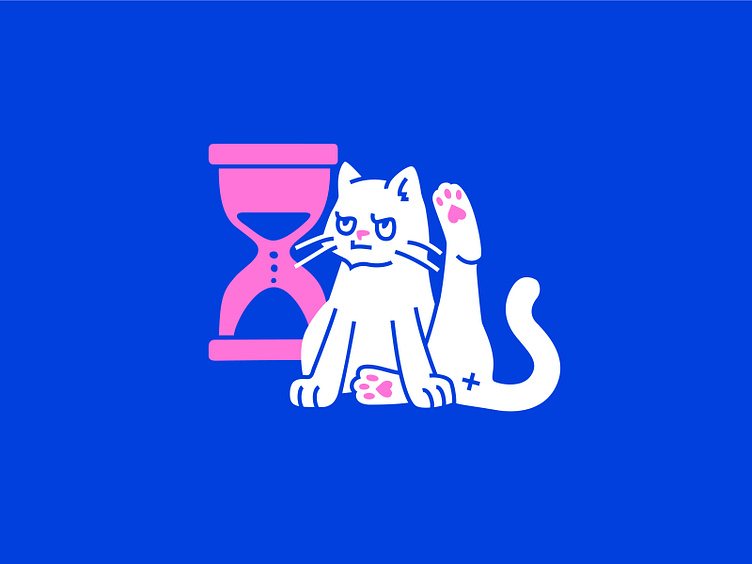
I myself am interested in finding the error page, because it just happens to have a more complex illustration.
And if you met such a cat on the error page, what emotions does it evoke? What would you think? #UX #UI #error #errorpage #cat #wait #waiting #angry #illustration #sandglass #art #digital #digitalart #digitalillustration #fun
More by Olga Prikhodko View profile
Like
