Jewelry - Landing Page
Hi Friday! 💪
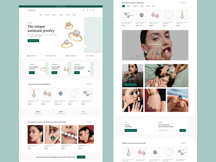
Today I would like to show you the conceptual design of the home page of a store specializing in selling jewelry. 💍
Design 🎨
The store's home page is distinguished by its simplicity and elegance, attracting attention from the first glance. I focused on a minimalist approach, where every element matters and affects the user experience. I used a clean layout that emphasizes the sophistication of the jewelry offered. The colors, mainly based on shades of green, not only refer to luxury, but also add an impression of exclusivity.
Navigation and Layout 🛰️
The adopted navigation is intuitive and easy to use. At the top of the page there is a clear menu that allows you to quickly move between jewelry categories. A well-thought-out arrangement of sections presenting products, ensuring clarity and convenience in browsing the offer.
Photos 📸
I used high-quality, clear jewelry photos that are the main focus of the site. Every detail is visible, which allows potential customers to better understand the quality and uniqueness of the products offered.
Exclusive Offers 🏷️
I placed featured products, promotions or new collections directly on the home page. This is a place that attracts visitors' attention by presenting unique and most desirable items..
Summary 📃
The design of the jewelry store's home page is based on a minimalist approach to design, using the color green to create an atmosphere of luxury and exclusivity. Navigation, aesthetics and functionality are carefully planned to create an unforgettable experience for visitors and encourage them to learn more about the jewelry offer.
What do you think? Let me know in the comments! 💬
Do you like it? Great! Don't hesitate to look at my profile!️ 🚀
Enjoy! 🤙
Contact: wojteklyzwa@gmail.com 🎯
