Case Study: Deja Brew
BACKGROUND: I created Deja Brew for a project as part of Google’s UX/UI Design Professional Certificate. We were asked to design a mobile app that solves for a problem we face in our daily routine. I’m always on the go, so making a stop for coffee or breakfast during my commute to work is a must. However it’s frustrating arriving to an establishment only to find a long line-up and therefore delay to my commute.
GOAL: Design a mobile ordering app that combines visual appeal with user-friendly design and functionality. I will do so by providing clear navigation, menu item details and customization options, and a straightforward checkout process.
RESPONSIBILITIES: Conducting user research, paper and digital wireframing, low- and high-fidelity prototyping, conducting usability studies, and iterating on designs.
TOOL: Figma
DURATION: September 2023
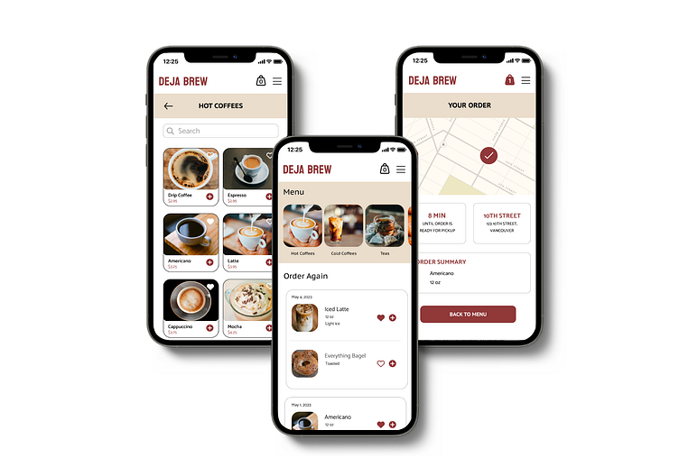
LAUNCH PROTOTYPE
Understanding the User
User Research: Pain Points
I conducted user interviews, which I then turned into empathy maps to better understand the target user and their needs. I discovered that many target users treat mobile-ordering apps as a convenient way to order ahead and avoid waiting at their destination. However, many opt out of using such apps because they don’t offer the same options as ordering in-store would.
The main user pain points are as follows:
Limited description of menu items
Unable to customize individual items
Difficulty paying; manually entering credit card details
Unable to quickly access previous orders for faster checkout
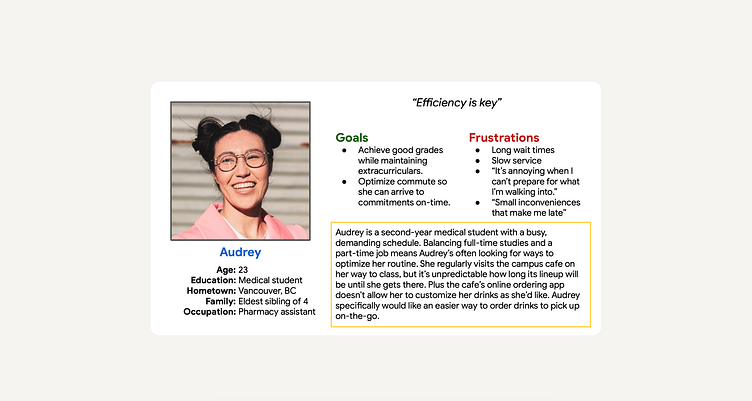
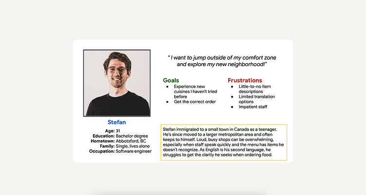
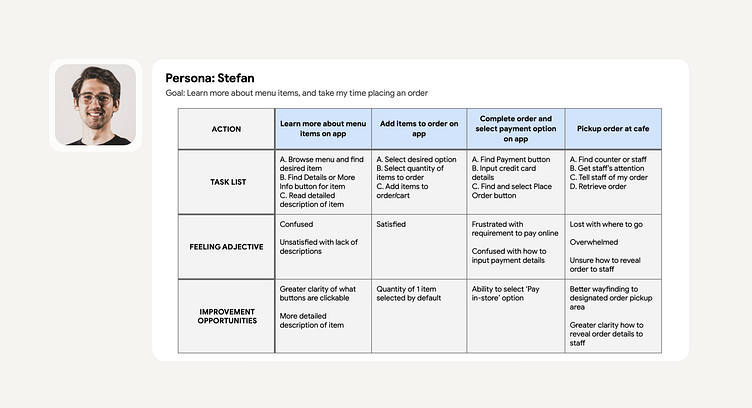
Personas
Audrey is a busy university student who needs intuitive app navigation and customizable features because she wants the checkout experience to be efficient and stress-free.
Stefan needs detailed product descriptions because he wants to feel confident in the decision-making process.
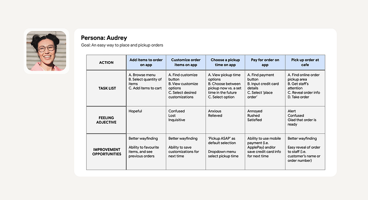
User Journey Maps
By creating user journey maps, I wanted to illustrate the process of how Audrey and Stefan behave, feel, and what they think while accomplishing their goals to address pain points or provide moments of delight.
Starting the Design
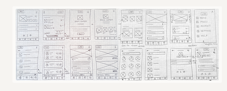
Paper Wireframes
Focusing on the core features identified during user research, I drafted iterations of each screen using pen and paper.
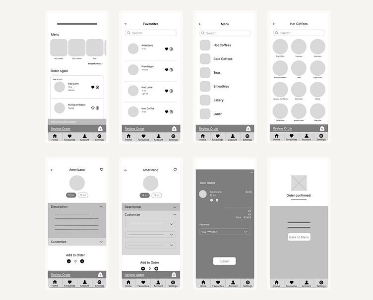
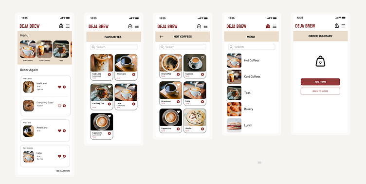
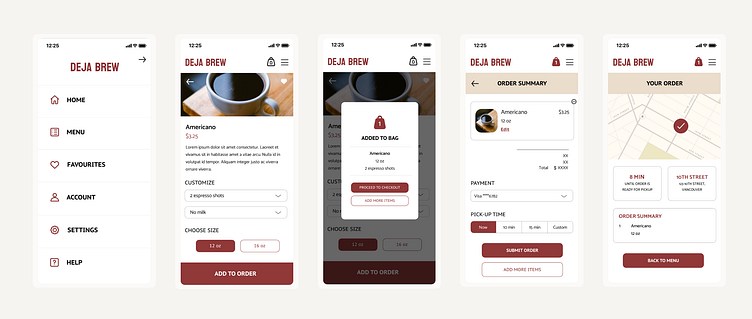
Digital Wireframes: Low-Fidelity Prototype
Using my favourite ideas from the paper wireframes, I began to build digital wireframes. Moving from paper to digital wireframes made it easy to understand how the redesign could help address user pain points and improve the user experience. I focused on the personalization aspects of the user experience, such as ‘Favourite’ items and item customization options. After dozens of iterations, these are the wireframes that best represented user flow and met user needs.
From these wireframes I created a low-fidelity prototype, which was then used to test functionality before incorporating it into the final design and ensuring accessibility for end-users. To create a low-fidelity prototype, I connected all of the screens involved in the primary user flow of adding an item to the cart and checking out.
Usability Study: Findings & Refinements
STUDY TYPE: Moderated
LOCATION: Canada, remote
PARTICIPANTS: 10, ages 25-40 years old
LENGTH: 20 minutes
FINDINGS:
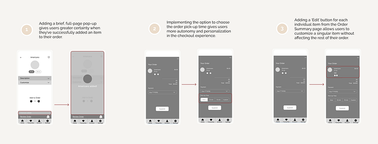
Positive Feedback: Users want a more obvious confirmation when they've added an item to their order.
Scheduled Pickup: Users want to know when to expect their order will be ready.
Edit Options: Users want the ability to easily edit items from the Order Summary page.
REFINEMENTS:
Final Design - LAUNCH PROTOTYPE
Takeaways
Throughout this process I learned that even a small design change can have a huge impact on the user experience. The most important takeaway for me is to always focus on the real needs of the user when coming up with design ideas and solutions. The first ideas for the app are only the beginning of the process. Understanding and implementing user feedback is key when iterating the app’s design.
