Finance app - 4. Skeleton screen
Hello Dribbble designers!
Here is my Series of 6 essential mobile UI screens. I hope you'll find it useful!
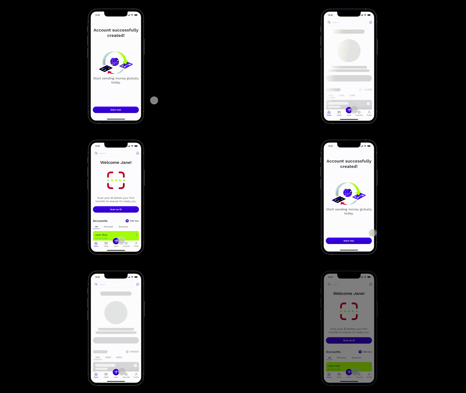
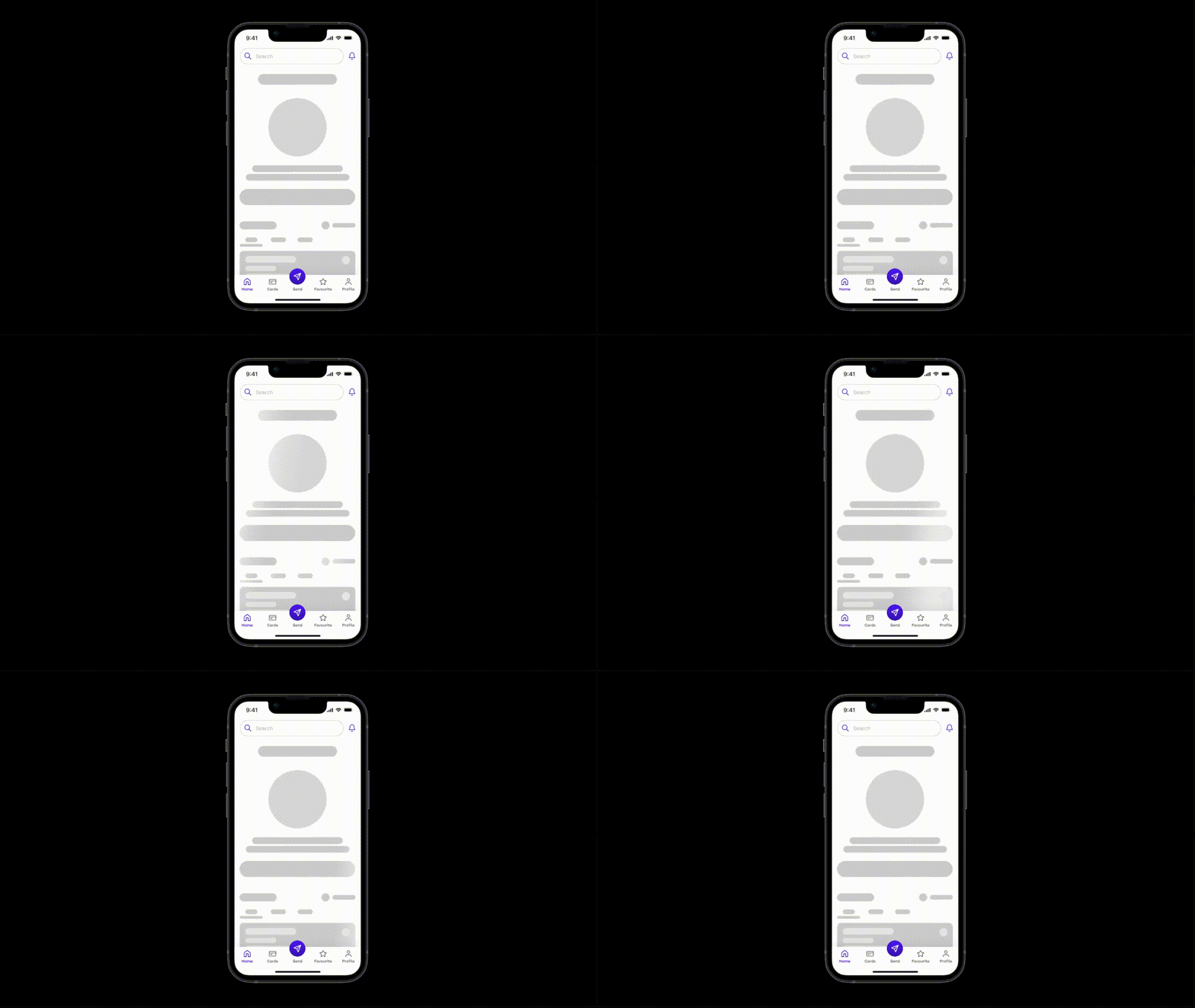
Today I'd like to show you 4. Skeleton screen.
"Skeleton" screen:
The Skeleton screen is a user interface (UI) pattern that serves as a placeholder for content while the actual content is being loaded. It consists of a simplified and stylized wireframe or outline of the page's structure, giving users a sense of progress and layout before the content fully loads. Here are key principles for designing the "Skeleton" screen:
Progressive loading experience:
Skeleton screen provide a sense of progression, letting users know that content is loading in the background. This helps manage user expectations and reduces perceived loading times.
Visual hierarchy representation:
By displaying a skeletal structure, the screen outlines the expected layout, showcasing the relative positions of different elements. This helps users anticipate content placement, creating a smoother transition when the actual content appears.
Reducing perceived wait time:
Users perceive wait times as shorter when they have visual cues that something is happening. Skeleton screen minimize the frustration associated with waiting for content to load by providing a visual indication of progress.
In summary, Skeleton screen is a valuable UI pattern designed to improve the user experience during loading times.
Feel free to leave your feedback! And if you like my work, please press "L".
Thank you for your support! 🙏🏼
Up next:
5. Home & Overview screen


