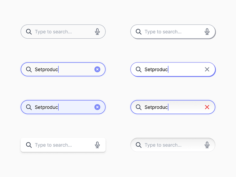
UX Tips to Make Your Search Input UI Stand Out
In the vast ocean of web design, search inputs are like lighthouses guiding users to their desired destinations. Here are essential tips for creating effective search inputs that make for a seamless user journey:
Placement Matters: Ensure your search bar is prominently placed and instantly noticeable. It's the beacon that visitors look towards when they start navigating your site or app.
Autocomplete is Key: Implement autocomplete to provide speedy and intuitive suggestions, reducing user effort and minimizing typing errors.
History Helps: Preserve search history to enable quick access to previous searches, allowing users to pick up where they left off with minimal friction.
Clarity is King: A clearly labeled search field with an appropriate icon or text eliminates confusion, guaranteeing users know exactly where to begin their search.
Responsive and Thumb-Friendly: A great search experience is consistent across devices. Design your search inputs to be easily accessible on mobile, where many users will interact via touch.
Provide Instant Feedback: Show some form of immediate response when users interact with the search bar. This could be a loading indicator or a quick display of results, reassuring users that their query is being processed.
These tips form the foundation of a powerful user interface, and there is no better way to understand their impact than by seeing them in action. That’s why we’ve included them all in our comprehensive Inputs UI Kit for Figma.
Whether you're looking to inspire your next design project or to streamline your workflow, our UI kit can serve as a valuable resource. Dive into a world where user experience and efficiency converge, and deliver search interfaces that users will love.
👉 Take a look at our kit and transform the way you design: https://www.figma.com/file/652eskZ40cSr0XXjrSn0dA/Search-Inputs/duplicate
