Revolutionizing Asset Management with IoT Brilliance!
Empowering Tomorrow's Tech with SensorSync: Where IoT Innovation Meets Real-World Solutions! 🌐
⚙️ Revolutionizing Asset Management Across Utilities.
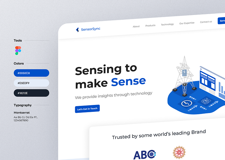
Comprehensive Design System:
🎨 Color Scheme: Chose a deep blue shade, to embody serenity, trust, and the dynamic energy of IoT. Blue signifies reliability and professionalism, making it an ideal choice for a brand at the forefront of IoT solutions.
🖋️ Typography: Chose the "Montserrat" font family for leveraging its familiar and user-friendly aesthetic to enhance readability and engagement. The bold characteristics align seamlessly with robust IoT technology, reflecting confidence and reinforcing the brand's image as a leader in the industry
📐 Spacing & Layout: Precision in spacing and layout, creating a visually pleasing and user-friendly interface for an immersive website experience.
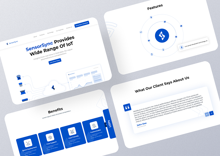
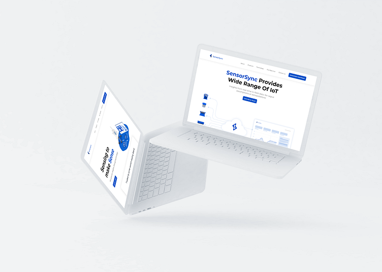
UX/UI Transformation: Revamped SensorSync's website with a focus on captivating users through a seamless experience and compelling design. 🌐✨
Information Accessibility: Designed the UX/UI to enable users to easily access information about SensorSync's IoT devices, fostering a deeper understanding of the technology. ℹ️💡
Web Dashboards for Devices: Created intuitive web dashboards for each IoT device, offering users insights into battery health, power consumption, and other key metrics. 📊🔧
Usability Enhancements: Improved UX by addressing usability issues, streamlining navigation, and enhancing user-friendliness. 🔄🚀
Brand Perception Boost: Aimed to elevate brand perception, increase engagement, and drive conversions through clear objectives and enhanced performance. 🚀📈
Modern Design Principles: Applied modern design principles to transform the website into a user-friendly platform that aligns with industry standards. 🎨💻
Motion Experience Integration: Integrated motion and animation to communicate complex data and provide users with a more interactive and engaging experience. 🔄🎬
Intuitive UI Prioritization: Prioritized an intuitive UI design that ensures visual clarity and consistency, creating a cohesive and understandable interface. 🖼️🔄
Privacy and Security Focus: Infused the design vision with a focus on providing meaningful insights while prioritizing privacy and security to build user trust. 🔐💡

Iconography Design
🎨 Modern Aesthetics: Crafted a modern and cohesive visual language using lined/wired icon designs.
🧠 Deliberate Communication: Icons incorporate two elements, distinctly representing context for clear comprehension.
🚀 User-Centric Impact: Prioritized a user-centric approach, ensuring icons enhance overall usability and foster intuitive interaction.
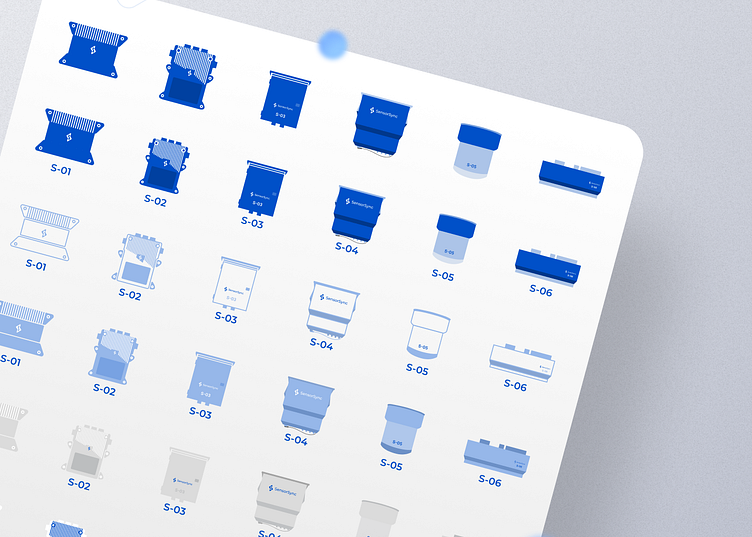
Diverse Iconography for Devices
🌈 Filled Icons: Vibrant and bold, filled icons add a touch of dynamism, making key device features visually prominent.
🕸️ Lined/Wired Icons: Clean and contemporary, lined/wired icons provide a modern aesthetic, ensuring clarity and simplicity in representation.
🎨 Duo Tone Icons: Duo tone icons bring depth and dimensionality, adding a layer of sophistication to device categories.
🌐 Flat Icons: Timeless and straightforward, flat icons maintain simplicity, ensuring immediate recognition of device functions.
🔍 Detailed Icons: Detailed icons capture intricate device features, providing users with a nuanced understanding of device functionalities.
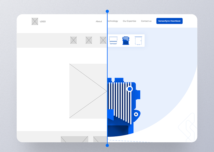
Mockup Version
Press 💙 if you like our design and share feedback!
Product Credit: Rotimatic
Enter your Visit Our Website: www.dcycle.design
Check Our Design: Case Study
Give Dcycle a follow below: