Elevating the Digital Presence of Productdots.com - Case Study
Introduction
Project Insight
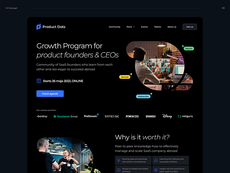
Our team embarked on a project with Productdots.com, a dynamic SaaS founders' community, aiming to boost their digital footprint. This project encompassed a total rebranding, website redesign, Webflow implementation, and crafting of captivating social media graphics.
Client Overview
Productdots.com serves as a gathering place for SaaS entrepreneurs and CEOs, offering a space to share knowledge and strategies for global business expansion. This community is comprised of venture capital-backed post-A series companies, experienced SaaS professionals, and SaaS companies with a workforce exceeding 30.
The Challenge
Our tasks were uniquely designed to match the client's distinct needs and objectives:
Branding Revamp: Developing a new brand image that appeals to driven and knowledgeable SaaS experts.
Website Overhaul: Crafting a site that promotes knowledge sharing among members and highlights their achievements.
Implementing Webflow: Focusing on creating a website that’s both dynamic and reflective of the community's innovative ethos.
Collaboration Approach
We adopted a deeply collaborative method with Productdots.com, emphasizing agile practices and regular communication. Our daily meetings were crucial for keeping up with the demanding schedule and ensuring our solutions were in sync with the client's vision and open to rapid iterations.
Wireframe Design
Structural Planning: The project started with wireframe creation to structure the website’s content, setting the groundwork.
Iterative Client Engagement: Regular interactions with the client during this phase ensured the end product met their requirements and aspirations.
Design Phase
Moodboard Conceptualization: In line with the client's preference for darker hues, we developed a moodboard to steer the design process.
Iterative Design Development: We presented 2-3 design alternatives, refining them through feedback until we arrived at a final design that perfectly captured the client's vision.
Development Phase
The development stage was marked by efficient teamwork and strategic technical integration.
Webflow Usage: We selected Webflow for its ease of use and adaptability, enabling a straightforward development process and post-launch site management.
Collaborative Working Model: We employed both designer and editor accounts to foster collaboration, giving the client direct involvement in the process.
Quality Assurance in Staging Environment: Initially, the site was launched in a staging environment, which was critical for exhaustive quality checks and final refinements.
Integration
The integration phase was crucial, focusing on enhancing site functionality and user experience.
Streamlined Data Management: Our approach included efficient data handling and management techniques to optimize site functionality and user experience.
Conclusion
Productdots.com's transformation was a cohesive effort, prioritizing practical design and the specific needs of the SaaS community. Our creation of a fresh brand identity and a user-centric website, underpinned by Webflow, focused on effective data management. The outcome is a productive and user-friendly website that stands as proof of our commitment to crafting bespoke digital solutions that surpass our clients' expectations.
-----------------------------------------------------------------------------------------------------------
Would you like to have a similar page designed for you?
Please visit our website 👉 dodonut.com/ to check out our projects and contact us for more info!
Don’t forget to ❤️ Press “L” if you like this shot!
More of our work on:


