Adequat
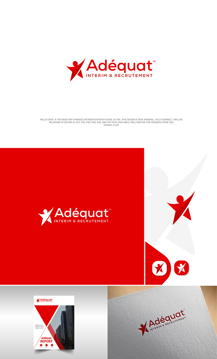
The logo is simple and modern, and it conveys a sense of professionalism and competence. The red and white color scheme is eye-catching and memorable, and the star symbol suggests that Adequat is a company that strives for excellence. The man in the logo represents Adequat's commitment to helping its clients achieve their goals.
Overall, I think the logo is well-designed and effective. It is clear, concise, and easy to remember. It also accurately reflects Adequat's brand and values.
Here is a more detailed explanation of the different elements of the logo:
The man: The man in the logo represents Adequat's commitment to its clients. He is standing tall and confidently, suggesting that Adequat is a reliable and trustworthy partner.
The star: The star symbol suggests that Adequat is a company that strives for excellence. It also conveys a sense of hope and optimism, which is fitting for a company that helps people find jobs.
The red and white color scheme: The red and white color scheme is eye-catching and memorable. It also conveys a sense of professionalism and competence.
The text: The text "Adequat" is displayed above the man, and the text "INTERIM & RECRUTEMENT" is displayed below him. The text is clear and easy to read, and it accurately reflects Adequat's brand and values.
