Mota - UX/UI web application design for remote work
🌐 Dive Deeper: Crafting Mota's Digital Playground
As we embark on the next phase of the Mota project, we are thrilled to unveil the intricacies of the platform's UX/UI design. At Outcrowd, we have gone beyond aesthetics, placing a paramount emphasis on elevating the user experience.
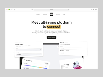
But before we delve into the details, don't forget to visit the MOTA website and Vote for us on Awwwards
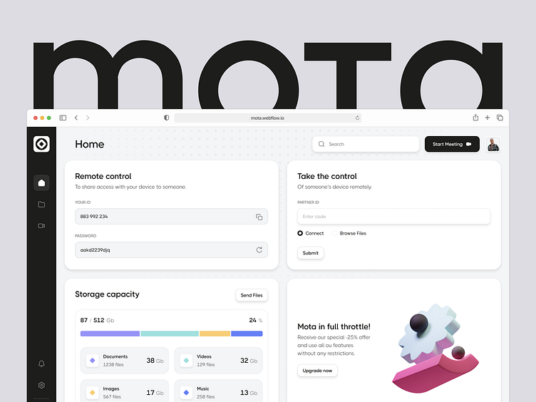
And now, the spotlight shifts to the beating heart of Mota - its platform itself!👇
🚀 User-Centric Design
The Mota platform isn't just a tool; it's an experience. Our UX/UI design revolves around putting the user first.
Simple, minimalistic, and intuitive – the mantra behind every click and interaction. We stripped away the unnecessary to let users concentrate on what truly matters to them.
🔍 Focus on What Matters
In a world full of complexities, we have designed Mota as a haven of simplicity. The interface is like a canvas where users can effortlessly navigate through their tasks without facing any distractions.
The design is simple and user-friendly, allowing users to easily make use of Mota's powerful features.
💡 Beyond Aesthetics
While aesthetics are crucial, our focus extended beyond visual appeal. We meticulously crafted the platform to ensure that every click, every transition, enhances the overall user experience. From onboarding to daily interactions, we aimed to make Mota a delight to use.
Don’t let your brand image get lost in the noise.
With design and branding, Outcrowd helps to reveal the essence of your brand and transform it into a powerful force that excels in results.
Email us: hello@outcrowd.io
Become a part of Outcrowd communities:


