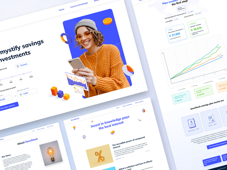
Case Study: SaveStack Website Design
Introduction
SaveStack is a groundbreaking design project that aims to redefine the investment landscape by providing users with a comprehensive and user-friendly platform. This exchange platform empowers users to make informed investment decisions based on their financial goals and risk preferences.
Main page
The main page is designed for simplicity, prompting users to input key parameters such as investment duration, initial investment, and additional monthly contributions. SaveStack offers a comprehensive list of investment areas, ranging from traditional options like cash and savings books to more unconventional choices such as digital tokens and fine wine. Users can explore a variety of investment opportunities tailored to their risk appetite and financial objectives.
Detailed Investment Plan Page
Once users select an investment method, the platform provides a detailed page with forecast information. A graphical representation displays the potential earnings in the best and worst years, as well as the average investment amount over time. The algorithmic risk assessment ensures that users are aware of the potential risks associated with their chosen investments, allowing for informed decision-making and risk mitigation strategies.
Educational Blog
SaveStack features an educational blog dedicated to providing users with valuable insights into various investment strategies, market trends, and financial literacy.
The blog serves as a knowledge hub, empowering users to make informed decisions and understand the dynamics of their chosen investment methods.
Company Vision Page:
SaveStack believes in transparency and integrity. The company's vision is highlighted on a dedicated page, providing users with a clear understanding of the company's values and commitment to financial well-being.


